Silence & Noise: A Window Display for Inform
Cutler was invited to design a window display for our neighbours over at Inform. They are a long time furniture retailer with one of the most impressive collections of furniture in the city and serve as a design hub here in Gastown.
We were thrilled for the opportunity to work with them, under the parameters of a small budget and with the opportunity to display any of the furniture pieces they carry.
The window display runs from June 1st-July 30th with an opening party for all, on June 7th.
A Concept of Silence & Noise
“An immersive environment that explores the idea of sound as a quality of the visual and physical environment”
We wanted to explore what sound looks and feels like in a space, without the presence of any audible sound. Colour, form, repetition and scale are some ways we created this visual soundscape. Moving through the space, we experience two contrasting energies and the point in the middle where the two meet. We describe this concept as Silence and Noise, or in technical terms “Time over Pressure”, which is the equation that describes how the vibrations of sound waves function in our environment and how space and time change the quality of the sound.
We were inspired to play off this concept as it relates to how we designed our visual soundscape, creating space and stillness in contrast with an environment full of colour, movement and reflections.
Discovering & Developing the Concept
Our process began with a conversation about what is at the heart of what we do. On a high level, our work is to create spaces that make people feel something. These spaces can evoke different moods, messages and concepts and often work toward a greater brand vision.
For this project, it was less about Inform giving us brand direction and more about them giving us free reign to show our creative potential and come up with a concept that engages the public and really lights up their window display.
The concept we wanted to push was: how could we take two dichotomous words or feelings and put them in opposition to each other? How does a person feel in each given space, and what is the tension that lies between the two spaces? We explored many dichotomies and descriptive words to land on the idea of sound, and how silence and noise could be evoked in a physical environment.
From there, we explored the imagery, colours and textures that relate to silence and noise, and how we could create a dichotomy through these basic design elements – form, scale, repetition and composition.
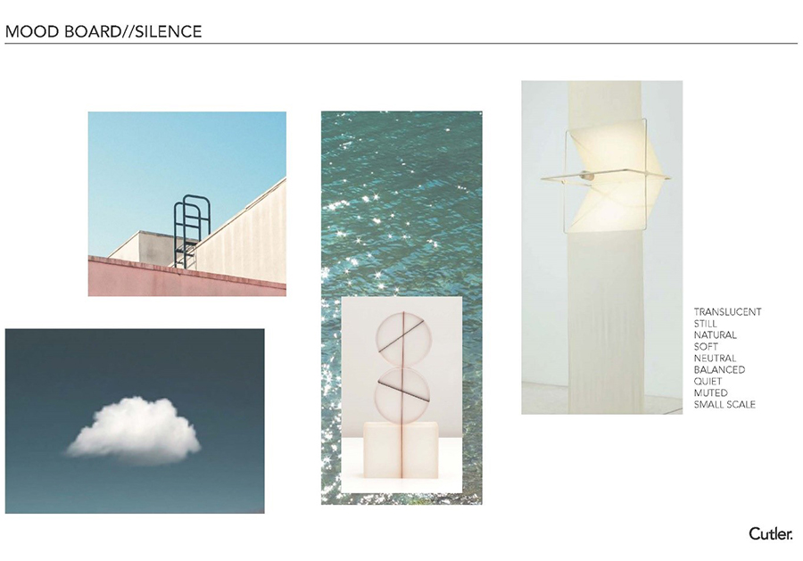
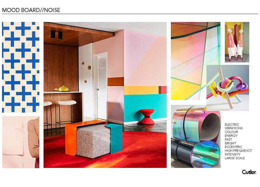
Exploring the Completed Design Through Words & Images
Photography by Brooke Stephenson
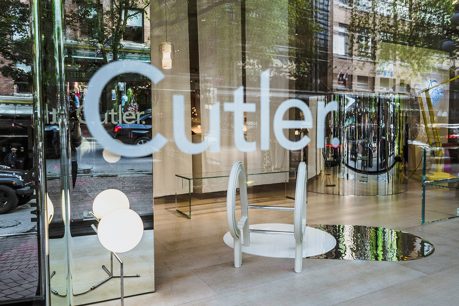
We landed on an airy, white and transparent palette for the silence side. Using suspended fabric, soft lighting and clear glass furniture in a simple and minimal composition to create the feeling of silence.
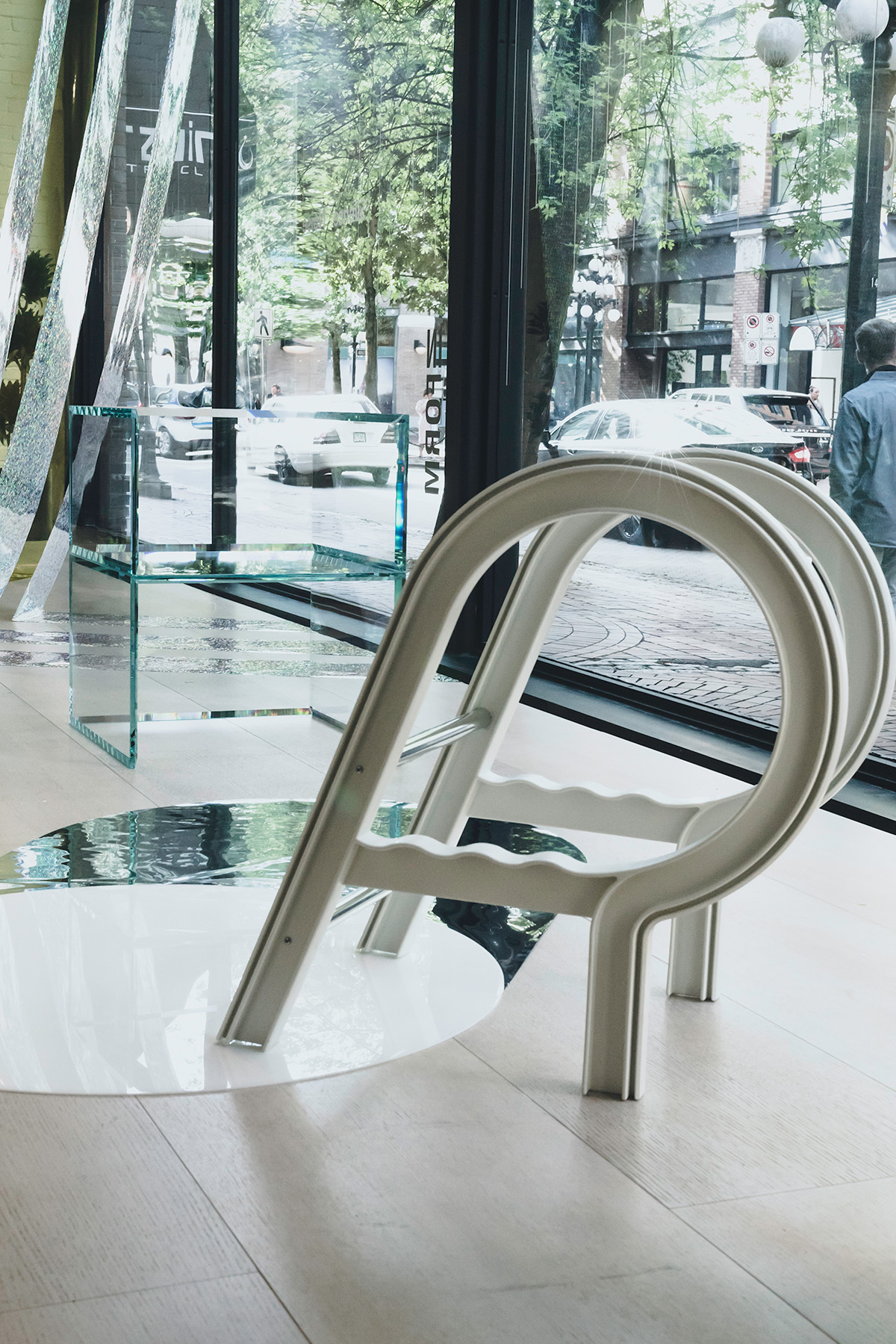
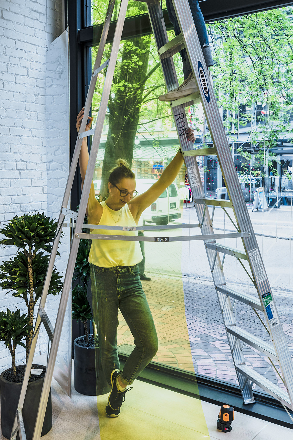
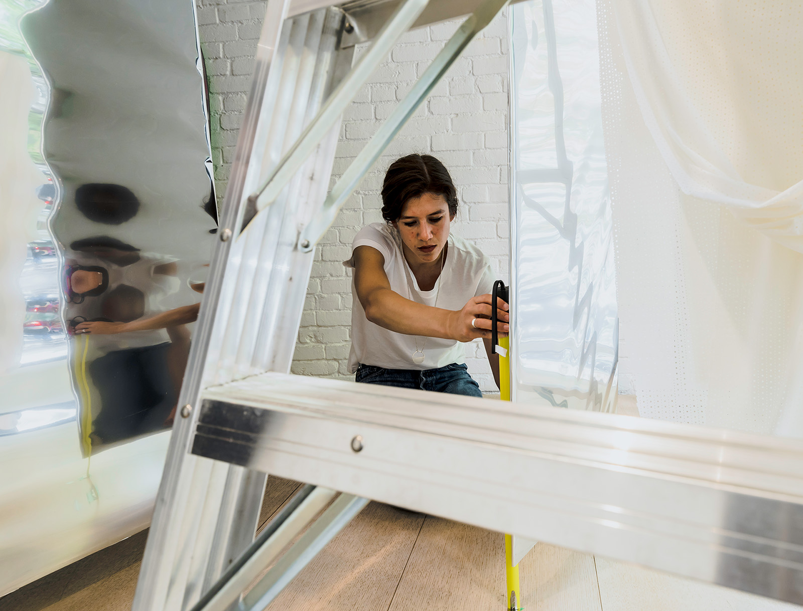
We used a still utopian summer approach, with playful summer objects composed together. Having a ladder placed above a white pool of acrylic was made to reference the quietude of slipping into a still body of water. We wanted the elements to feel as if they were floating in such a way that they brought a sense of calm to the space.
As the space moves towards the Noise side, we begin to bring in a more hectic composition of materials, colours, and reflections. Materials look to be suspended from the ceiling in an angular repetitive formation.
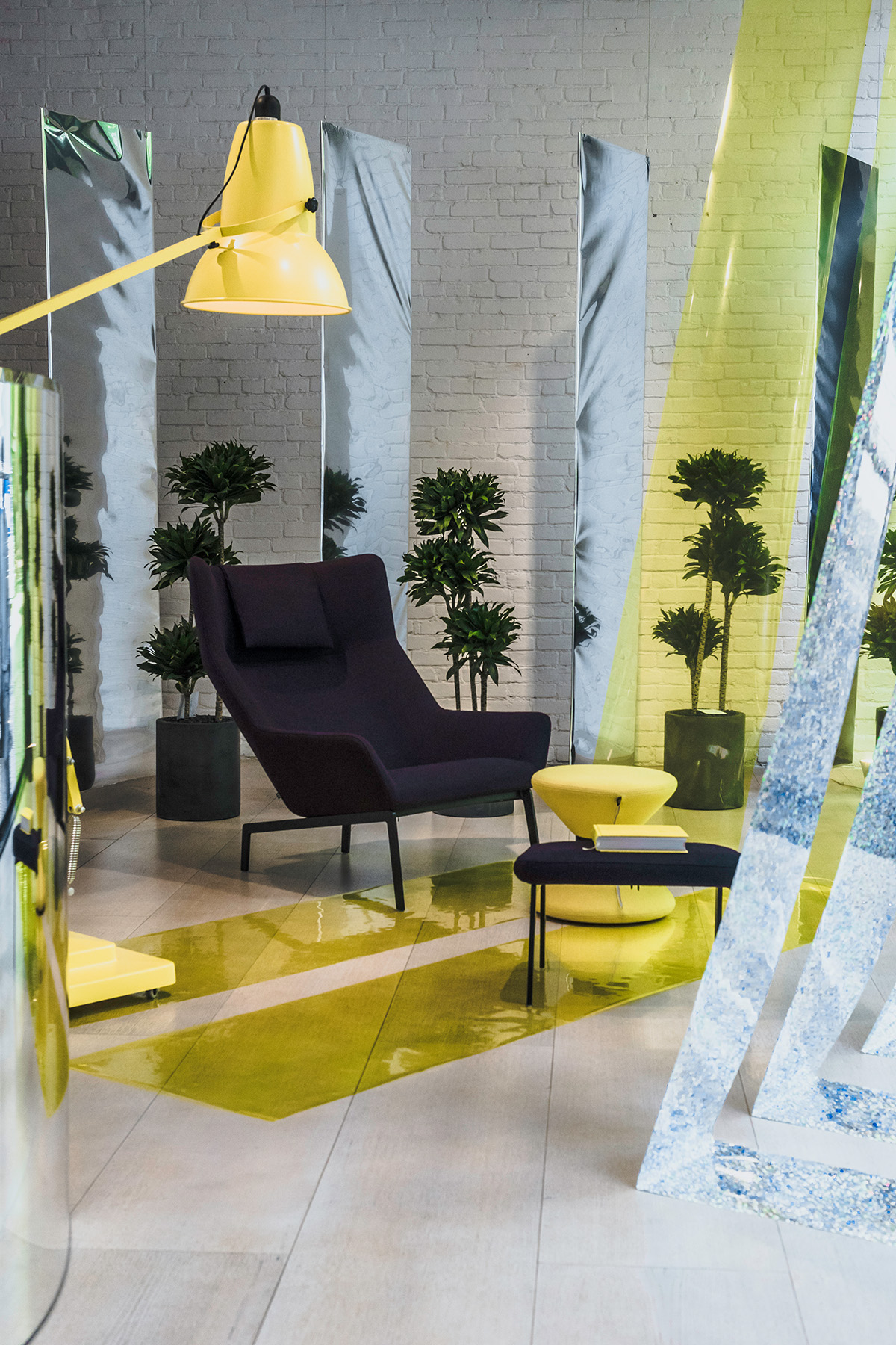
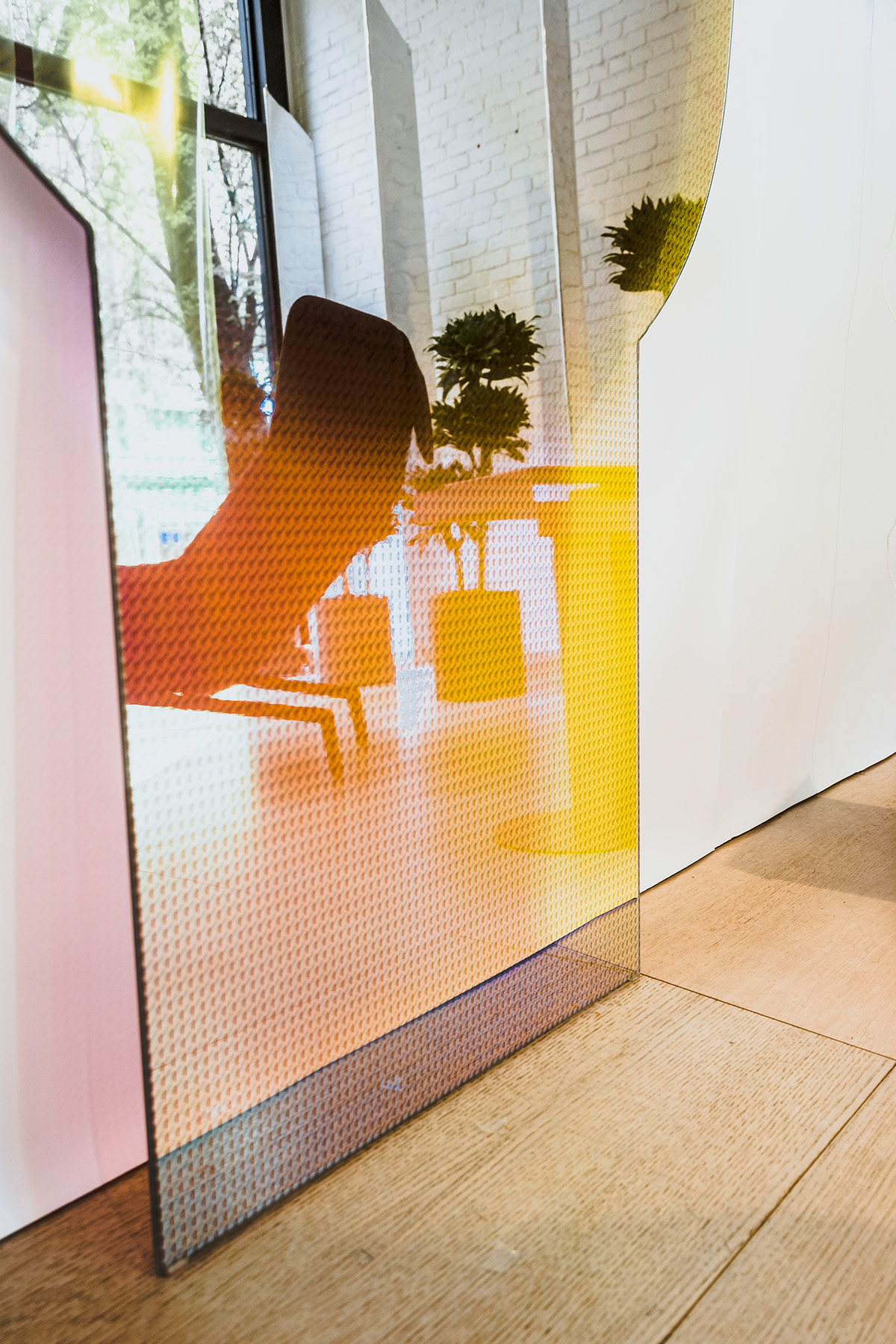
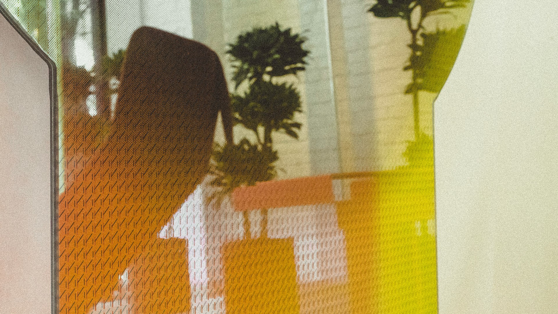
Furniture is placed in an a-typical composition within the jungle of mirrors and colourful transparencies. We use mirrors to reference the idea of sound bouncing off the environment to create visual reverberations.
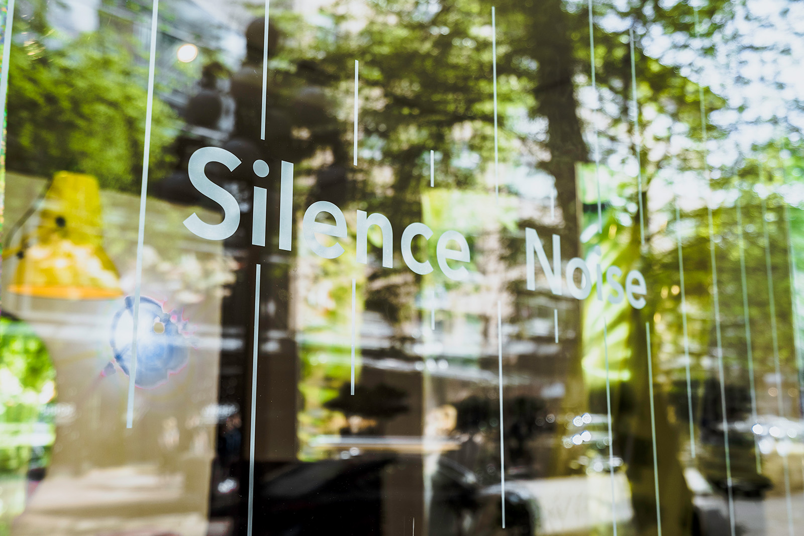
To tie this concept together we used a large abstracted window graphic to represent a sound wave moving from low amplitude to high amplitude. As you move across the window display it’s almost as if you feel the pulse that is reflected on the window.
