Cutler Case Study: Cannabis Studio
As cannabis legislation has been changing across Canada, we’ve been working with multiple cannabis retailers to develop store designs. The industry is moving at a rapid pace as everyone learns the latest requirements and works to get project teams moving.
Often the interior design, cannabis retail challenges, and even the brand is little more than a thought when clients first come to us.
As designers of the built environment, we always find it helpful to put ourselves in the shoes of the people who will use it. This could be customers that come into the space to shop, patients waiting in a healthcare facility, or our own clients who ultimately work in and operate the space.
In an effort to put ourselves in the cannabis retailers’ shoes, we decided to develop an internal case study for cannabis retail. We paired up with our friends over at Pivot & Pilot Creative to develop the brand strategy for our fictitious store, “The Cannabis Studio” and then translated it into a store experience. Through this exercise, we developed tips for anyone getting into, or interested in getting into, this new fast-growing market.
The Concept
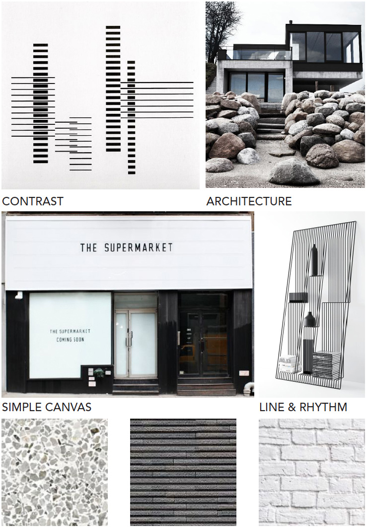
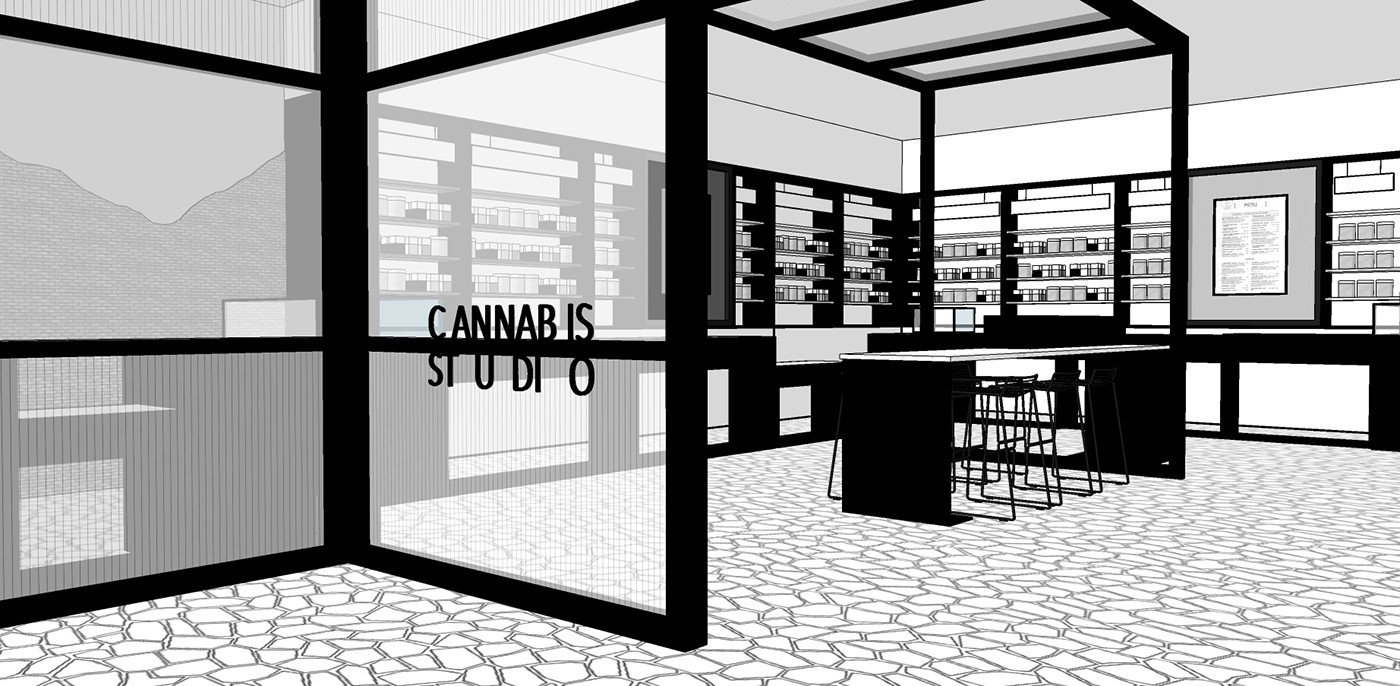
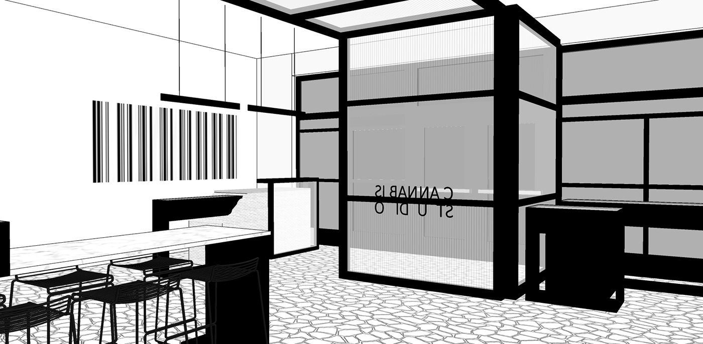
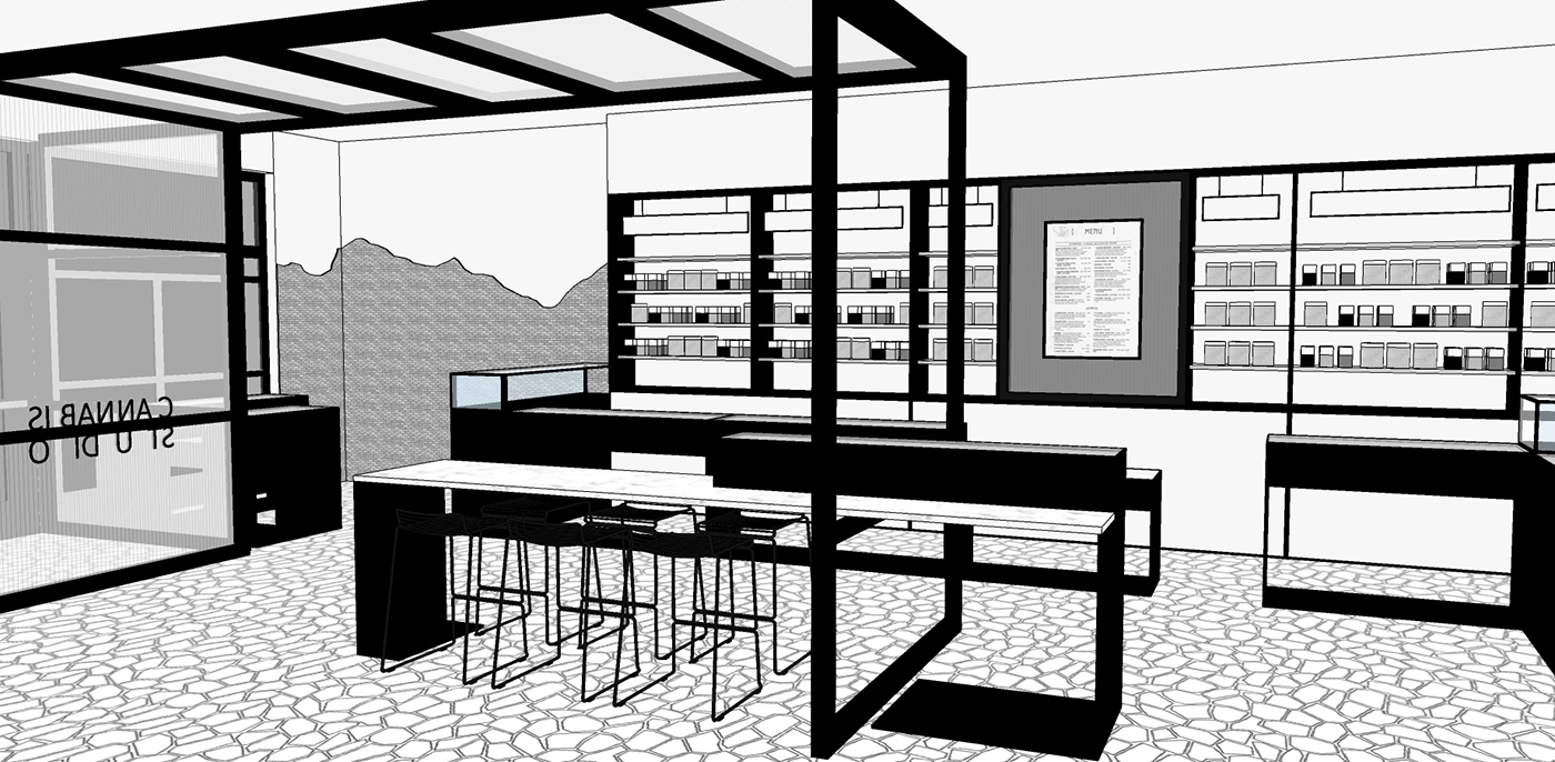
For this case study, we started by looking inward to our own brand identity. The concept is inspired by Cutler’s own brand aesthetic: minimal, calculated, meticulous; a starting point for creativity. A contrasting palette flows through the forms and textures: black and white, smooth and rough, straight and jagged. We played with rhythm and line to create linear direction that creates natural movement.
The Brand
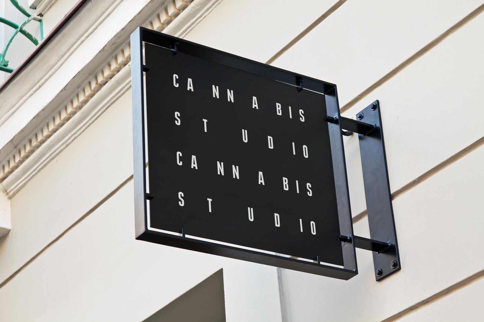
credit Pivot & Pilot Creative
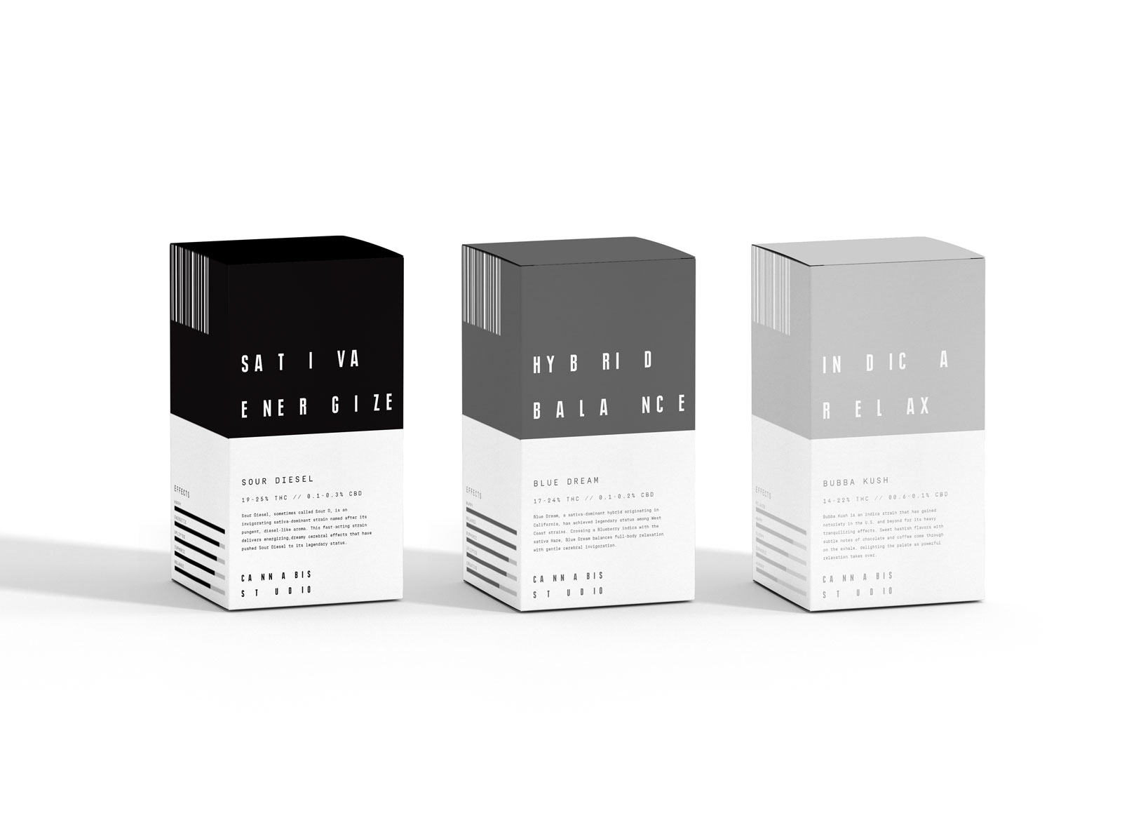
The Cannabis Studio is a brand intended to disrupt the stereotypical image of a dispensary and target the urban, creative, modern cannabis consumer. The brand focuses on the multi-sensorial effects of cannabis on users and utilizes a muted, greyscale colour system to represent different strains and their effects on the body and mind.
With restrictions on marketing in the cannabis sector, businesses are focusing on creating lifestyle brands that use experiential marketing tactics to educate their customers and create a loyal following.
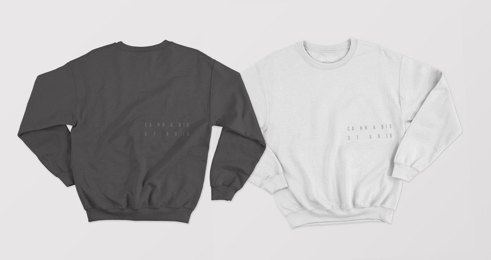
The Cannabis Store’s space and brand is built to promote education in their community. The sleek, modern gathering place hosts regular workshops and events, publishes books, sells apparel and use approachable, engaging labels and menus. By focusing on building individual relationships with each customer and positioning itself as a trusted educational resource, The Cannabis Store aims to create lifetime brand advocates rather than one-time shoppers.
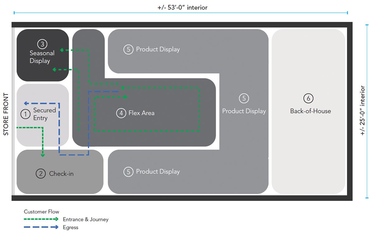
The Zones
A semi-enclosed area that guides customers directly to the check-in area.
TIP: If the jurisdiction allows, keep visibility into the store open to inspire curiosity.
Where staff greet customers, check ID, create customer profiles and answer general inquiries.
TIP: Treat this area like a hotel concierge so staff are positioned as experts that can guide guests in the right direction.
Dedicating a portion of the front window to changing displays will keep the storefront looking fresh and attract attention throughout the year. For jurisdictions that do not permit visibility of product or merchandise, consider graphic applications.
TIP: This area can also be utilized for pop-up retail. Invite suppliers to host a demo session or provide a curated display for a short period of time.
This circulation space can be utilized to host educational displays, interactive kiosks, small seminars or presentations, and community collaboration.
Secured wall and floor showcases display all retail offerings. Displays are designed to be serviced by a staff member, similar to a high-end jewelry store. This service method of display enables staff members to interact with customers and provide them with a more personalized selection process.
TIP: Create dedicated display segments and clear wayfinding to make it easier for customers find what they’re looking for.
Requirements in the back-of-house space will vary between each location and operation. Areas may include manager’s office, security monitor/IT room, secured inventory room, secured shipping/receiving area and washroom.
The Learnings
A successful cannabis experience must encompass strategies of retail, healthcare and hospitality environments. Look to all of these for best-practices.
The majority of customers will be new to your product and your entire market. Put them at ease by making the product range easy to understand.
With any regulated substance, there are several rules and regulations that need to be followed. The primary factors in terms of the environment are typically:
- Provide ID checkpoint at entry to confirm age
- Block visibility to merchandise from outside the store
- Display product in secured cases that are accessible by staff only
Be sure to check with local jurisdictions to confirm any other requirements that you may need to follow.
credit: Pivot & Pilot Creative
credit:credit Pivot & Pilot Creative
credit:credit Pivot & Pilot Creative
credit:credit Pivot & Pilot Creative


