Customizing Fixtures to Sell More Products & Create Lasting Impressions
When it comes to designing in a retail context there are a number of things to keep in mind. Not only does the space need to be safe and efficient for the staff who spend their days there, it needs to provide a comfortable and engaging atmosphere for the customer. The best way to serve multiple needs, while sticking to the aesthetic concept of the designers and remaining aligned with the goals of the client, is through customization.
By working from the ground up, we’re able to manipulate form and composition to create unique experiences and strategically influence the individuals for whom the design is intended. It’s also what helps our clients improve the overall performance of their retail space and, ultimately, drive more sales.
Giving careful consideration to the specific needs of everyone involved, custom work allows us to seamlessly and effectively optimize the engagement of our client with their customer, their space and their product.
Understanding The Customer: The Foundation of Effective Retail Design
The first step in customization is learning about our client’s user demographic and what their goals, desires and intentions are when they walk into a space. We need to be fully aware of those needs in order to cater to them deliberately and strategically.
If, for example, our client is looking to appeal to a high-end demographic that’s drawn to a refined upscale experience we, in turn, ensure all our fixtures serve that purpose and contribute to that aesthetic.
Project Skin: Center Island
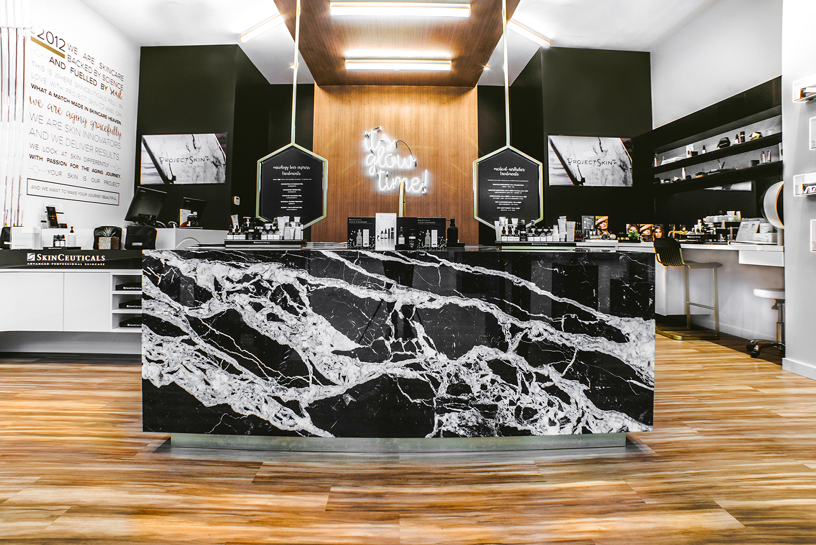
The striking, custom marble and brass, central island at Skinceuticals by Project Skin in Richmond Center creates an instant feeling of luxury. As customers enter the store they are invited to lean up against the grand marble face and use the expansive surface for testing out and learning more about the variety of products available. Project Skin offers express facial peels, which also happen around this central island. Customers can hang their coat, recline back and admire the details of the brass mirrors suspended from the ceiling above, which provide both privacy from the front of the store and an extensive view of the process as it unfolds. All these custom details and pieces of millwork serve a concise purpose, enriching the customer’s experience in the space and creating the intended feeling of luxury.
VIEW PROJECT: Skinceuticals by Project Skin
Designing New Experiences & Building Stronger Brands
As designers, one thing we find inspiring about custom work, is the ability to create new ways of experiencing a space and a brand.
The world is changing rapidly and we’re constantly adapting our designs to keep up with the growing needs of our clients. The market for off-the-shelf fixturing is limited and as designers we are very excited to explore the potential of how custom work can help our clients reinforce their brand message and build a stronger brand identity.
To have this effect, it’s incredibly important to create simple, memorable and concise interactions within a space. Working from scratch allows us to build that potential into the very way we design the fixtures.
Gray Olive: Planter Bar & Wayfinding Details
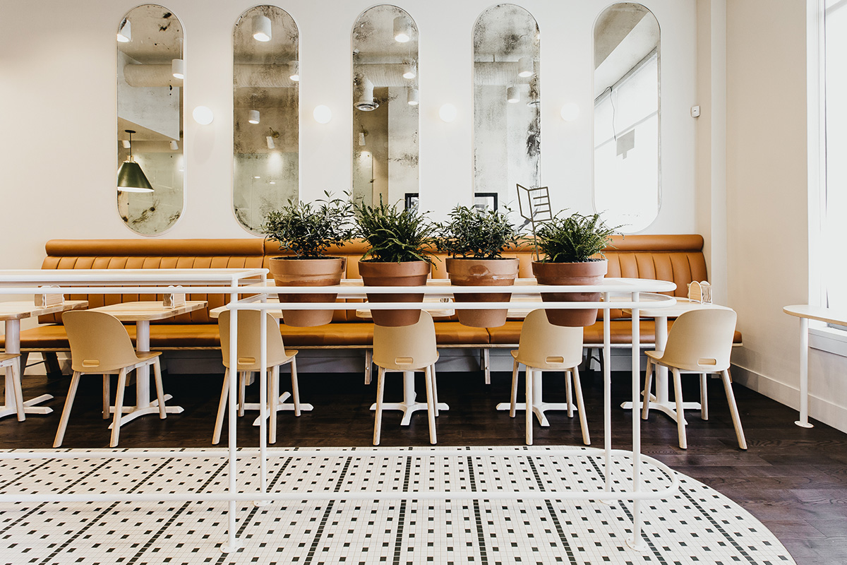
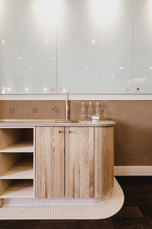
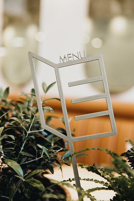
We designed many custom details at Gray Olive Cafeteria in Hastings Village. The aim was to create a space that conveyed the concept of a deconstructed greenhouse. We used a central planter bar as a key piece in executing this concept. Half of the bar is a home for potted plants. As customers enter the space they are met with green foliage right away. The second half of the bar is a place for people to post up or sit down to eat their food and drink their coffee. We included details that reference the labelling systems often used in greenhouses and gardens. A small brass icon sticks into the soil of the plants and indicates where customers can find menus to browse before selecting what they want to eat.
VIEW PROJECT: The Gray Olive Cafeteria
How Do We Help Our Clients Sell More Product?
At the end of the day, we care about creating an experience for our clients that helps them to build long-lasting relationships with their own clients and users. We want their customers to feel taken care of, to leave with a new understanding of the brand and to want to return time and again.
This happens subconsciously when people enter a space that feels right.
What does it mean to have a space feel right?
- Layout: Fixtures follow a logical flow and progression, taking customers on a journey through the space
- Balance: From the large scale right down to the smallest detail, everything feels refined and in proportion
- Lighting: Enhances the mood and provides a sense of comfort allowing customers to explore the product or space with ease
- Function: Whether taking an article of clothing off the shelf or leaning their bodies up against a bar, fixtures feel like they function for them personally
- Intuition: Customers navigate the space intuitively, have places to put their coat or grab a seat etc.
These are all important things that we see as part of the selling equation.
Boardwalk Optometry
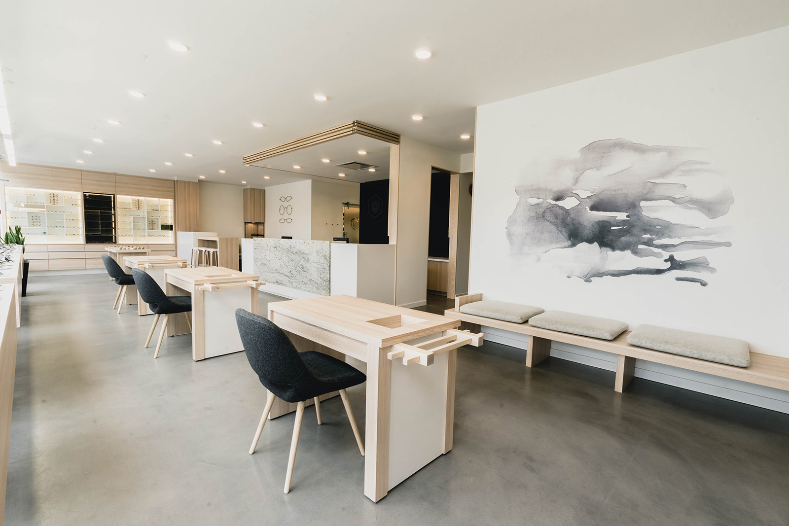
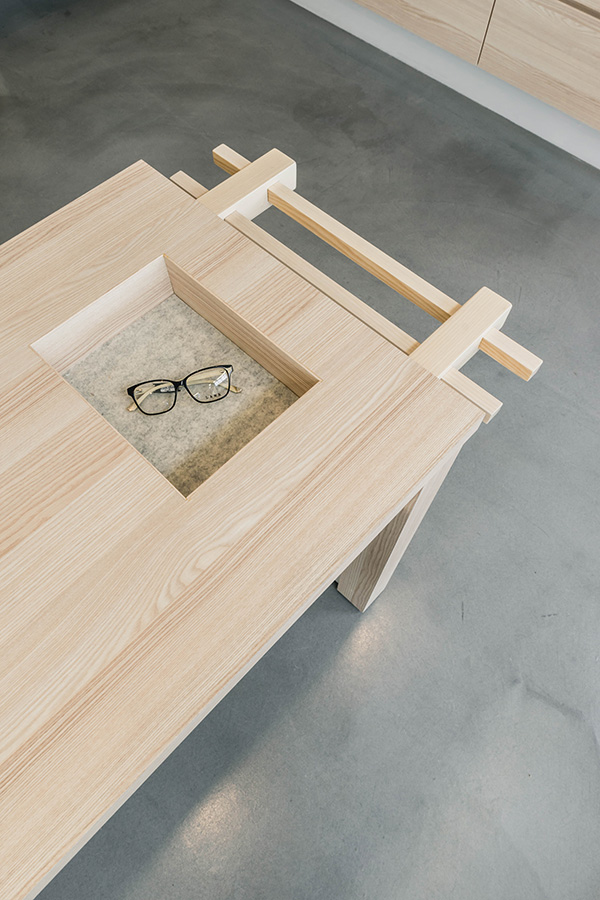
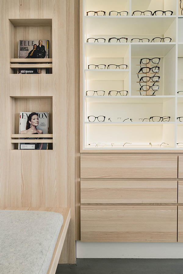
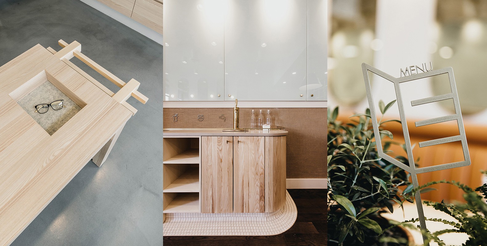
Boardwalk Optometry in Surrey, B.C. is a great example of a space that uses custom furniture and fixtures to create an intimate relationship with their clients. The fixtures are designed as small hubs where customers can sit and learn about the best products for their unique and individual needs. We wanted to ensure that customers felt that connection between their needs being met and how the staff interacted with them. The design of the fixtures allows for this comfort within the space in many ways: a bench with a built-in in custom magazine rack and comfortable cushions, the way the glasses are lit and open to be interacted with, to the recessed felt lined trays in each consultation station.
VIEW PROJECT: Boardwalk Optometry
Customized fixtures and design elements allow us to create a feeling of comfort within a space. They encourage people to stay longer, explore further and engage more deeply with a product.
At the end of the day, we all want to be part of something; we want to feel like the brands we support also supports us. As designers, this universal desire for connection provides us with an opportunity to create a lasting impression.
As mentioned earlier, the key to all of this is to first understand our client’s target demographic on a deeper level. Armed with that understanding, we can build stronger brands and drive increased retail performance for our clients by creating just the right environment for people to connect.


