The Importance of Individual Brand Experiences
The millennial generation is interested in something different than previous generations. Millennials are generally not drawn to mass marketing and brand labeling. It is, rather, the opposite. The personalization of a product like Apple’s iPad, iPhone or the various other iThings, are precisely that — things meant just for the individual. This personal approach may appeal to a lot of people (even an entire generation) but, in general, it is successful precisely because it doesn’t overtly address the masses.
As a designer then, the question often faced is how to best help clients who want to provide that personalized experience desired, while still appealing to people as a group. In other words, how do you create a space that reaches a broad market segment while simultaneously speaking to people on an individual level? How can you design a space that will feel unique to everyone no matter their individual preferences or lifestyle?
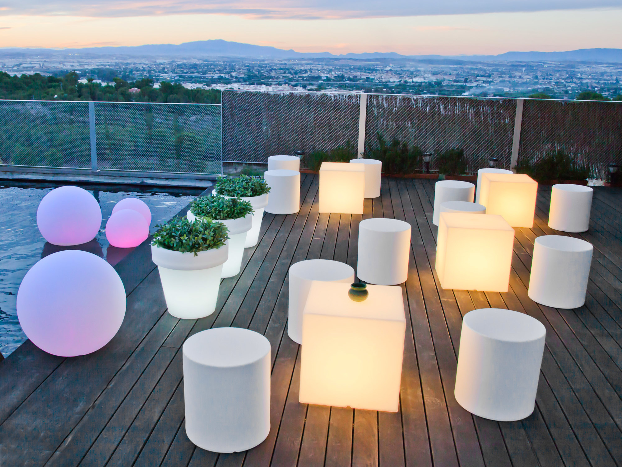
LED OBJECTS IN GERMANY – www.hornbach.de
Simple lit geometric forms afford use as table tops, seating, flotation items and planters as well as stackable decor for creating spatial settings.
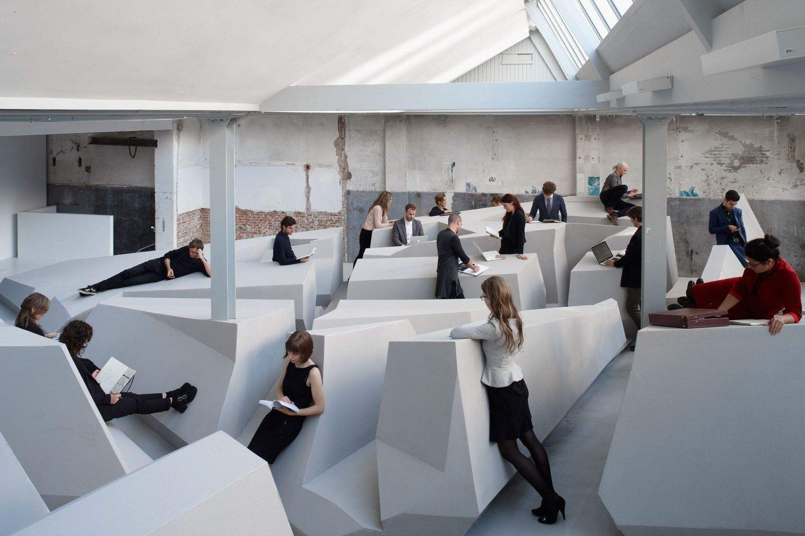
One can consider something called design “affordances.”
An affordance is the aspect of an object that dictates how it is used, usually on an unconscious or intuitive level. We press buttons, turn knobs, and bounce balls without needing to be explicitly told or instructed. However, affordances also encompass all the possibilities of how that object could be used. As Donald Norman states in his book, The Design of Everyday Things (1988): “When actual and perceived properties are combined, an affordance emerges as a relationship that holds between the object and the individual that is acting on the object.” This is what allows for individual interpretation to happen.
Consider a park bench. It’s a seat, a resting place or stopping point. There is no sign to label it as such, we intuitively know. At the same time though, it could also be a bed, a shelter beneath, a poetic sculpture, even a stage or meeting point. The list goes on depending on the varying users with endless unique needs and experiences.
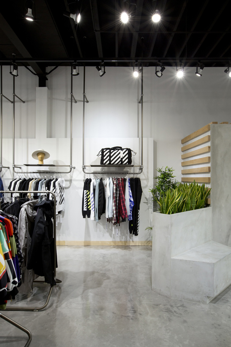
Feuille by Cutler on Howe Street in Vancouver
In this space a custom sculpted bench planter that is also a display platform and space divider implies the options for use, reminiscent of affordances offered in an urban parkour setting, amongst the other elements.
As a design element, affordances are what can allow for personalized interaction and definition in a given space. The key is simplicity and subtlety. And the result is often minimalist. It’s all about providing a blank canvas that leaves space for the individual to interpret as they please; one is invited to B.Y.O.E. (bring your own experience). With no labels or instruction, and therefore no “right” way to interact, it offers the comfort of choice. The overall design aesthetic is streamlined and simple by default because any excess or extras would be adding too much direction. There needs to be no clutter, no confusion.
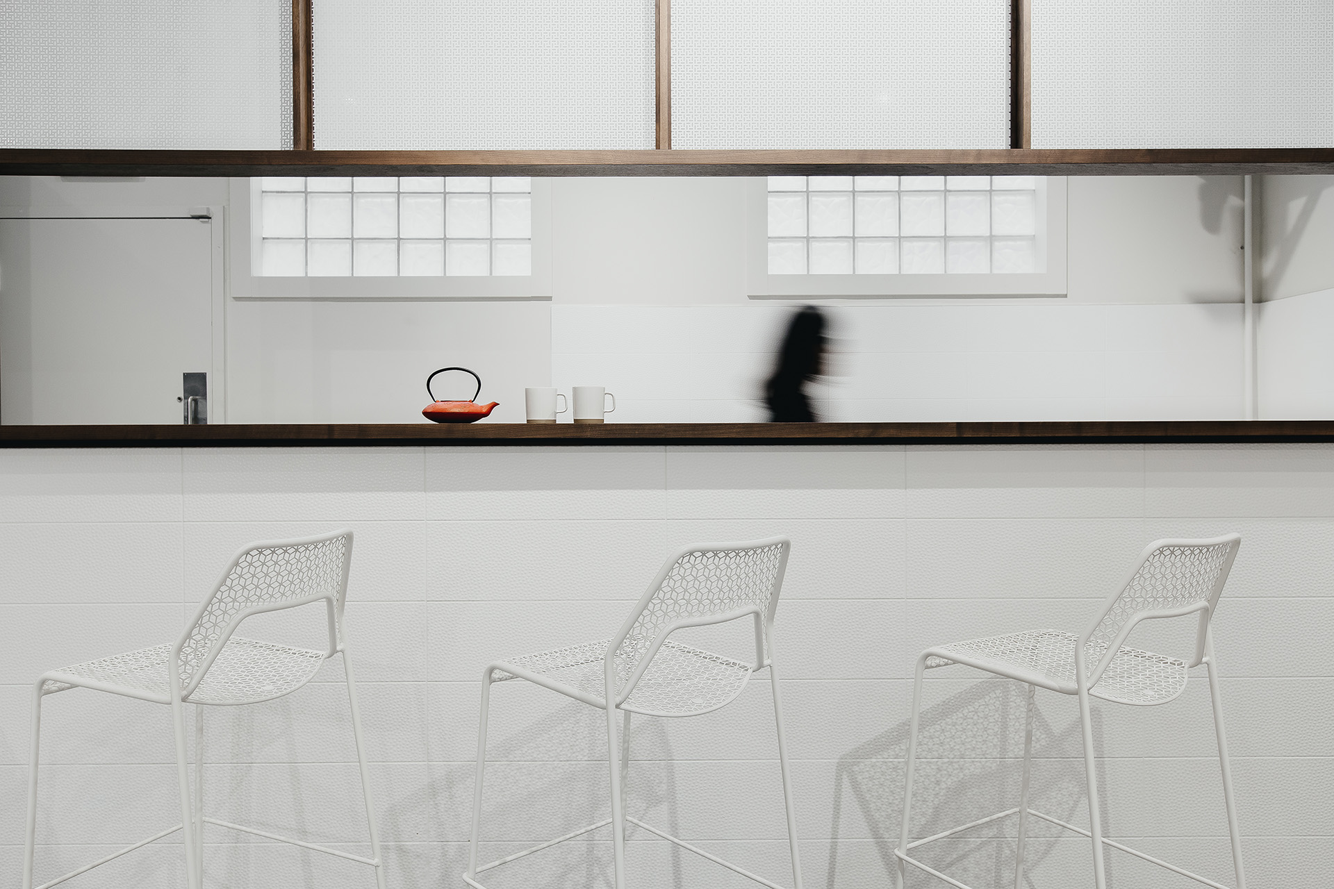
Silk Road Tea by Cutler on West Fourth
This tea bar offers a sampling area while also offering educational or waiting services and a place to relax – a subtle addition to a retail environment creating more user freedom of experience in the space. View The Case Study Here.
By designing simply then, we create a platform that utilizes what people are already doing or bringing with them. The design is setting the stage for customers to create meaning, and experience the brand for themselves. Offering “affordances” in a space allows a ‘brand experiencer’ to be in the space as they are, to latch onto products in their own individual way and see how it could be incorporated into their lives: Armrests on furniture afford ease for arms, foot rests on bar stools afford ease for hanging legs, glazing affords seeing through to a larger vista for greater openness, soft textures afford the instinct to touch, or offer the option to settle in, upright and vertical elements offer shielding or something to lean against.
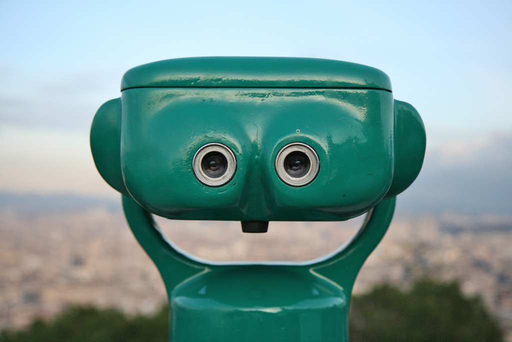
Why Do We See Faces In Objects? – BBC
This public binocular fixture also has the appearance of a face or creature to encounter, while offering a flat surface on the top for placing things, as well as a base perhaps for stretching or leaning against.
The design of a space or object impacts our experiences and behaviour when we interact with it, whether we are aware or not. Varying subliminal emotions and messages are interpreted as a result. This is a key consideration for brand development in a space. When encountering objects, we naturally see them for what they are, but we can also see them for what they might be. And while that potential is something that is unique to each individual, the simple design of a space (one that allows for those various considerations to occur) is something that, ironically, appeals to the masses.
Encouraging an individualized brand experience is a way of reaching a mass market that ultimately wants the same thing. How to best provide that experience is one of the most integral roles of a designer. Especially given the unique demands of the millennial market, and the specifics of your particular brand, careful consideration needs to be given to the impact of objects, their placement and how they’ll be engaged. While you may wish to appeal to as many people as possible, creating space for the individual is the key. Considering that, and opening our eyes to new ways of seeing a space: a workplace, a public interior setting, even a particular table in a restaurant – the mandate for the space can be revealed while also illuminating targeted human appeal through one’s sense of discovery.
Product designer, Jasper Morrison, gets inspiration “by the spontaneous use of objects with a sense of discovery.” Though often very subtle, we can discover for ourselves, with close observation, what affordances we notice in our environment.
What can you discover as a creative way to interpret the next object you encounter, or next space you enter?


