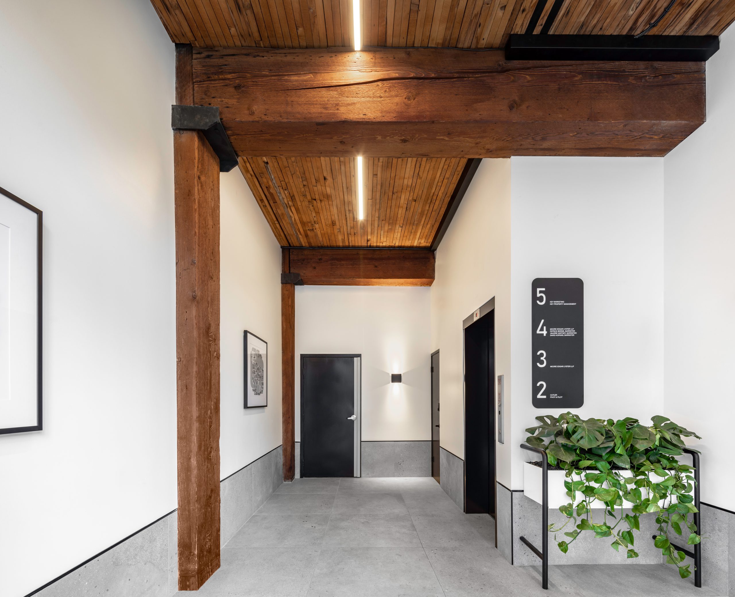
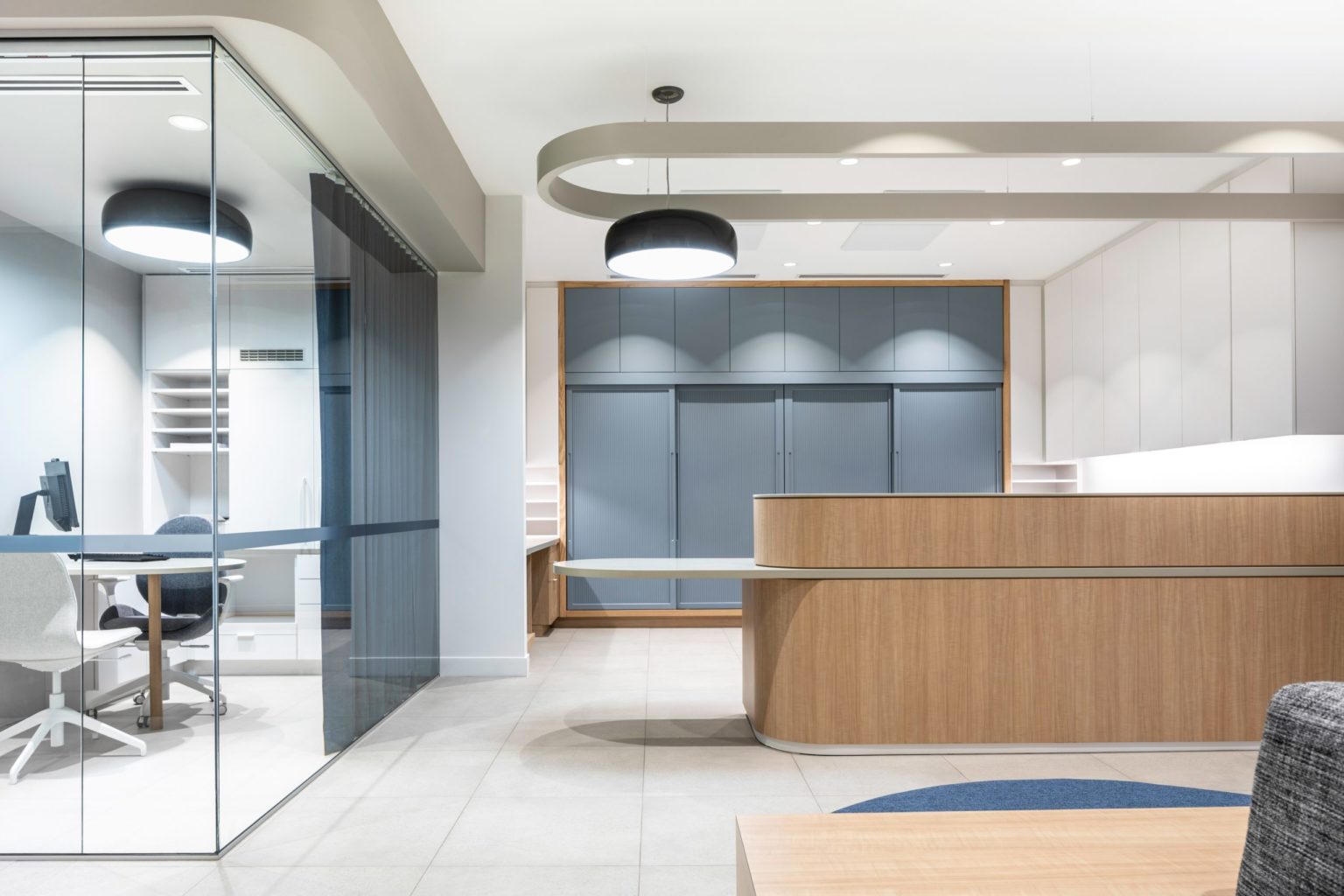
As visitors’ first impression, the building lobby sets the tone. A neutral palette was developed to suit any of the building tenants, whose suites open directly off the elevator. Custom signage ensures that visitors have clear directions.
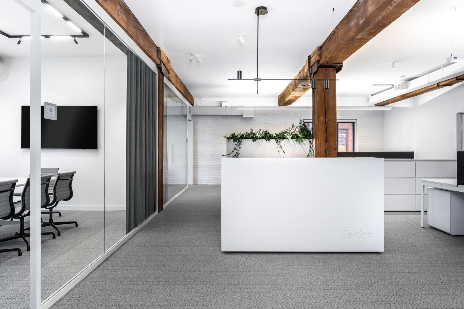
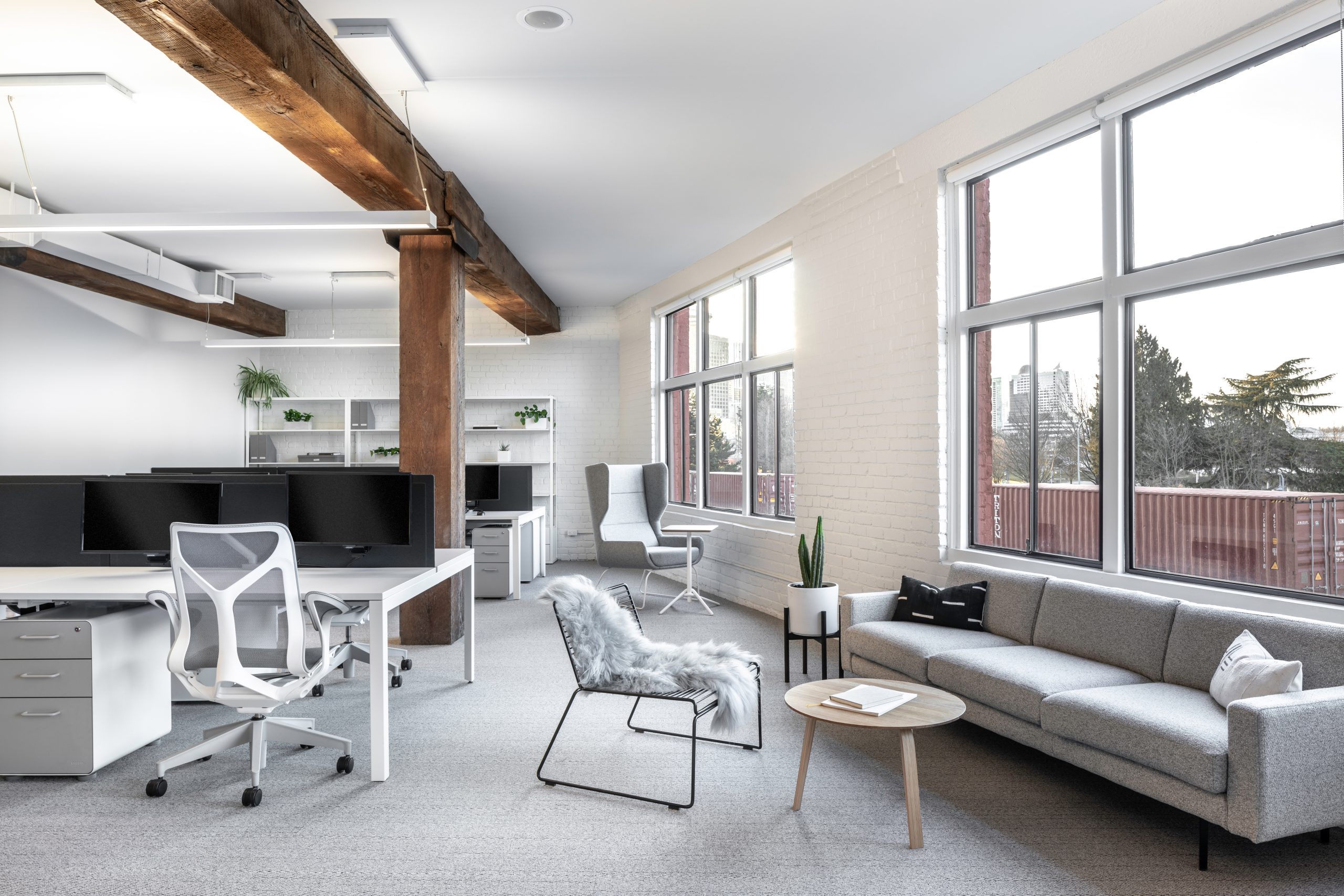
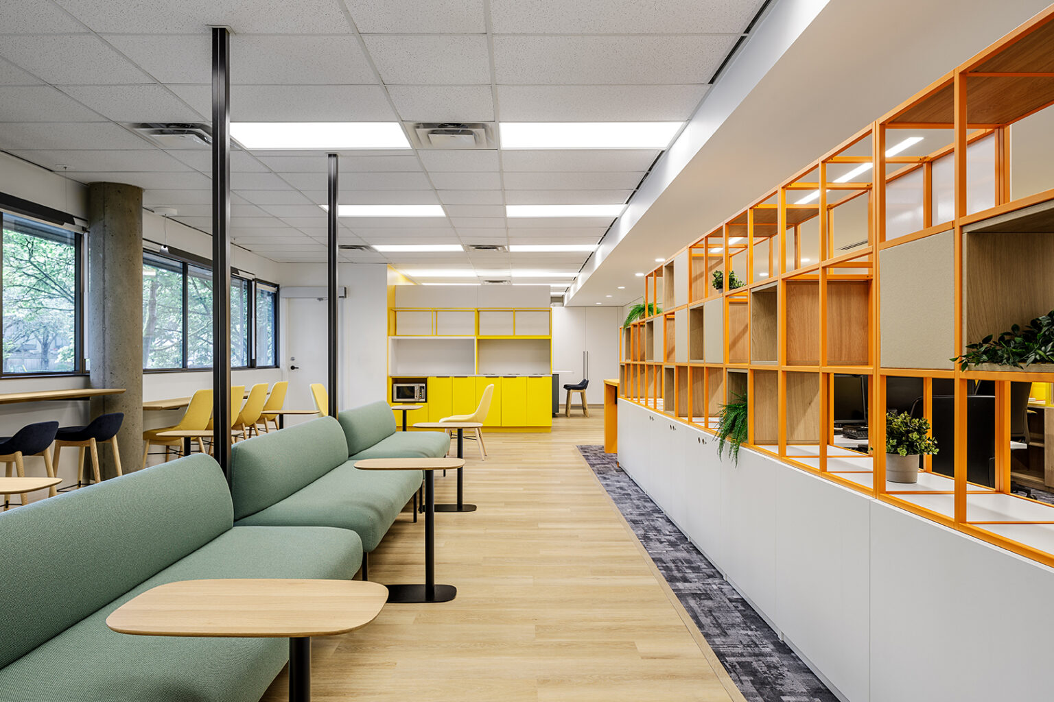
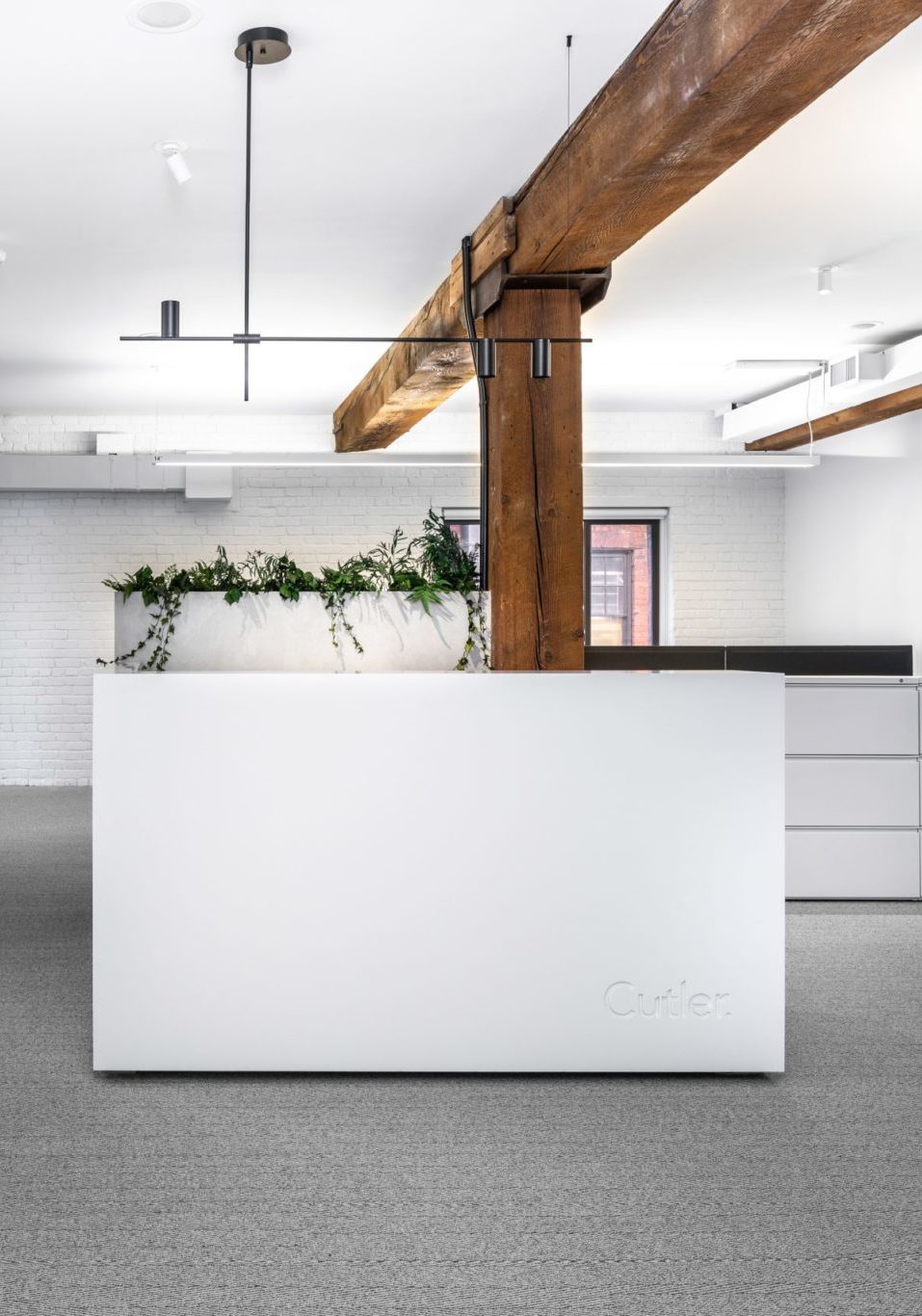
On the 2nd floor of 195 Alexander, the elevator opens to Cutler. The space plan is anchored around a collaborative work style and expansive windows. A large staff hub on the north side of the office enables us to maximize the view while maintaining open site lines from the work spaces.
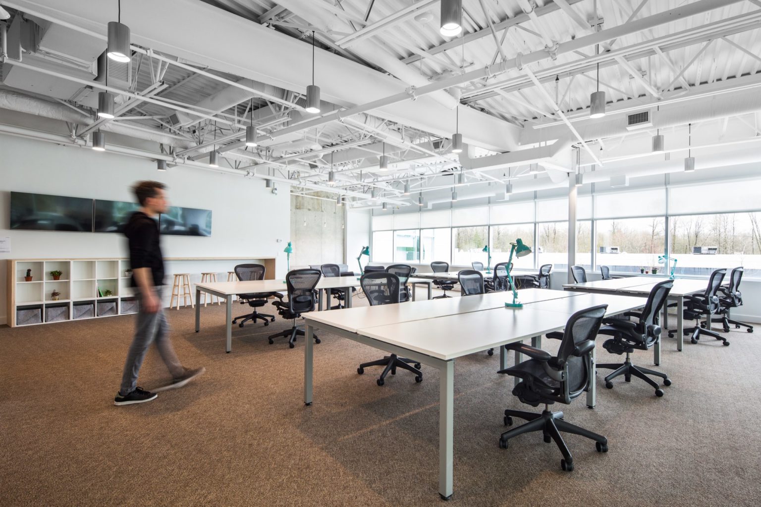
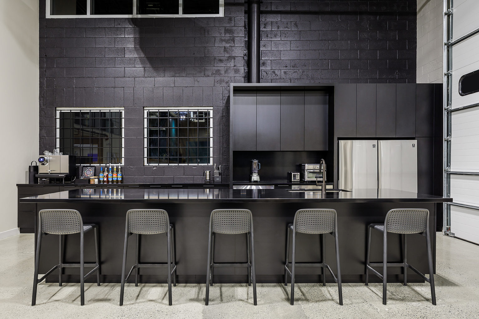
Inspired by a lab environment for creative thinking and research, the foreground of the workplace is a blank canvas. As a group of creatives who design for our clients, we limited the palette to neutrals and simple finishes; eliminating any unnecessary visual distractions so our client’s designs can stand out.
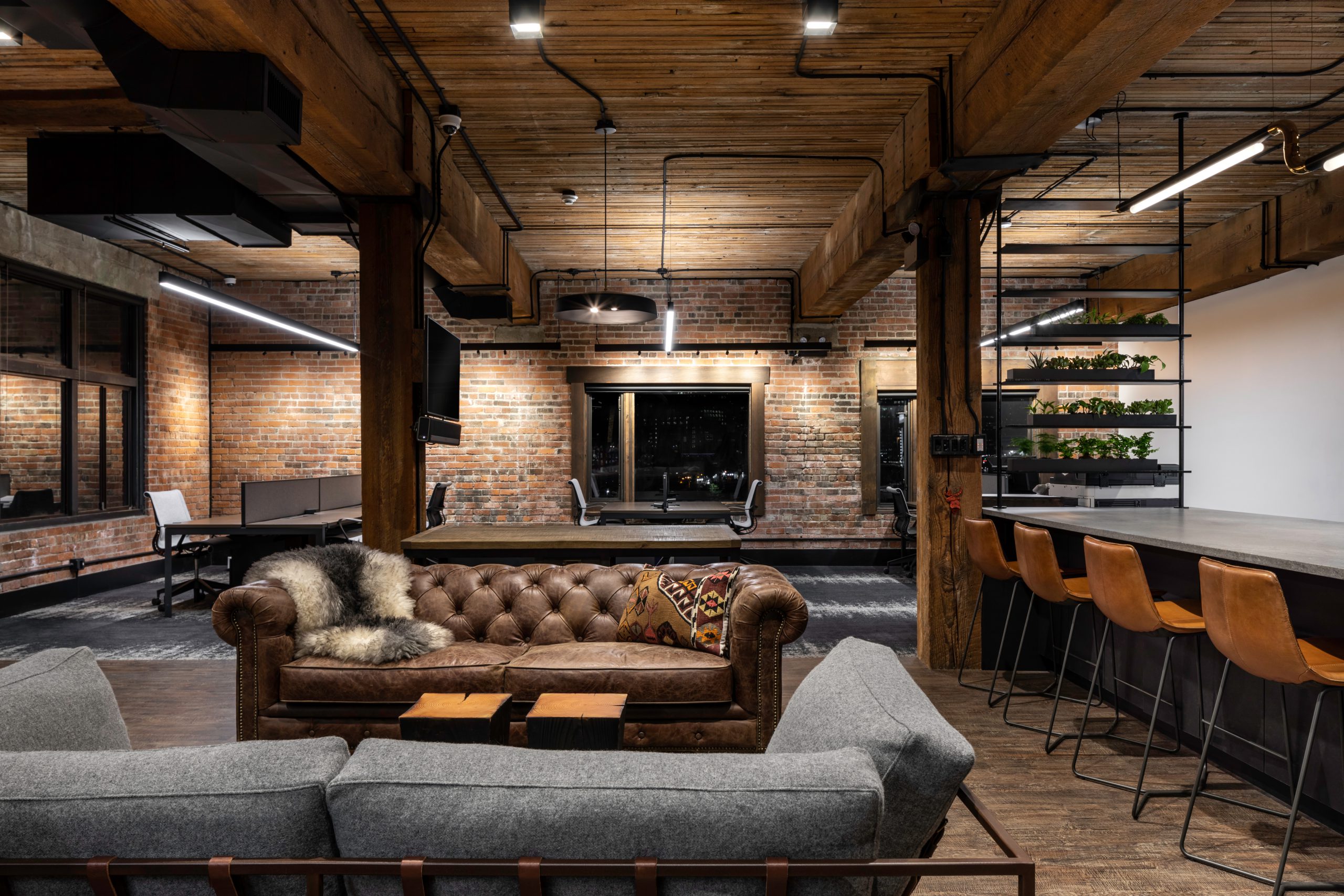
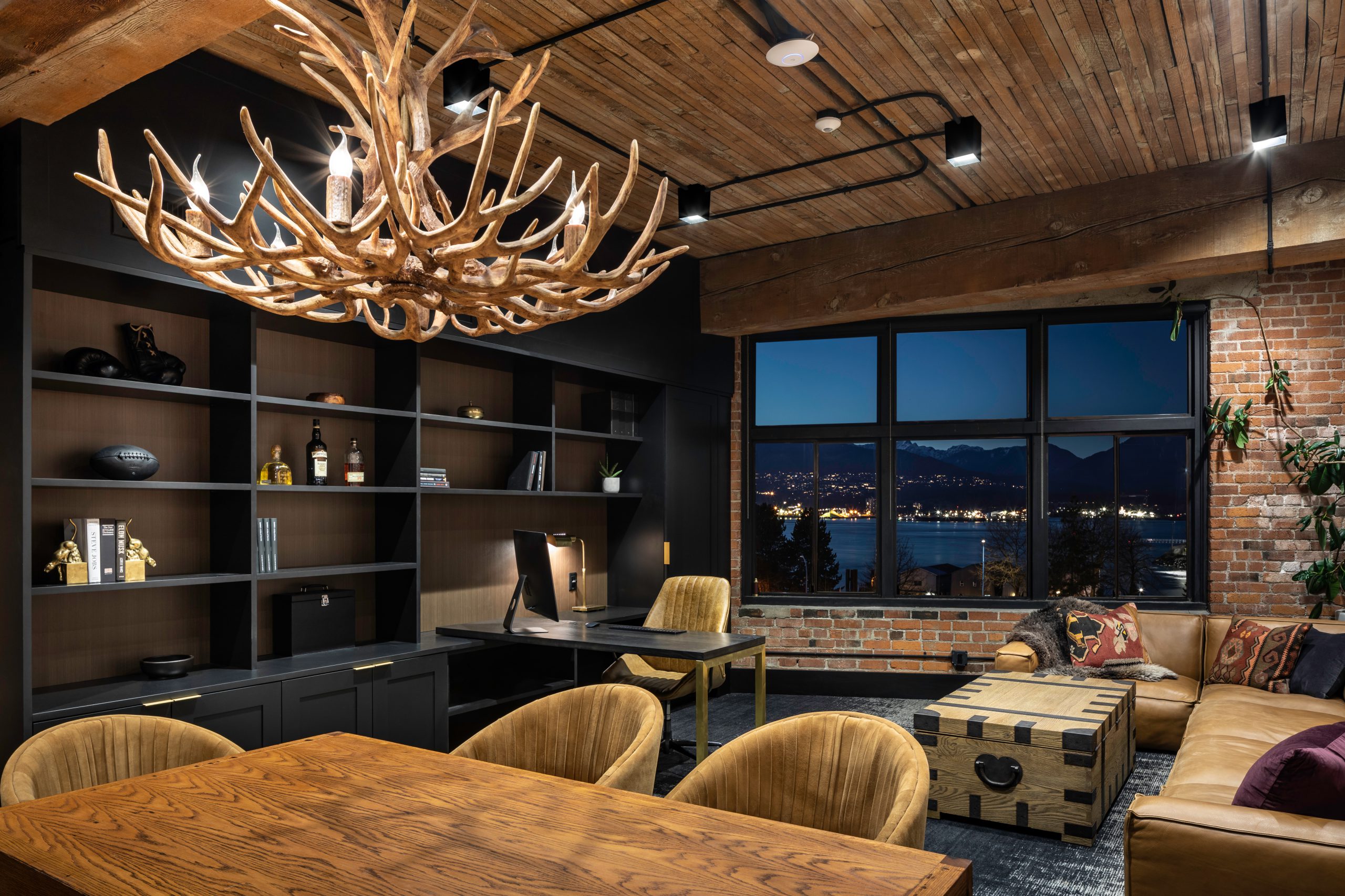
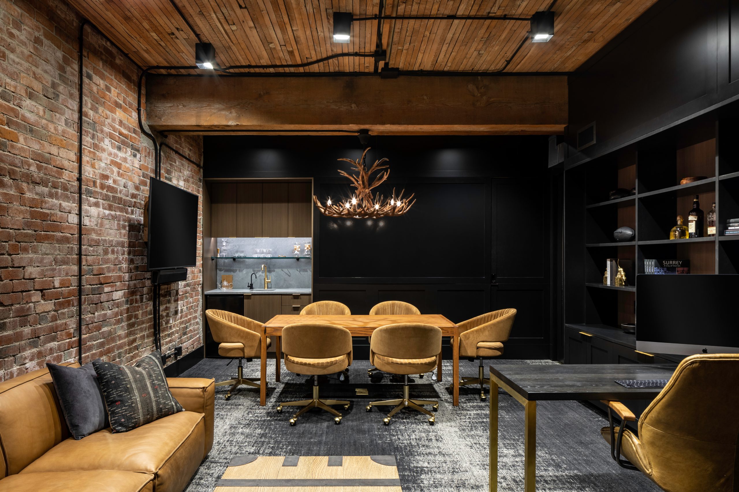
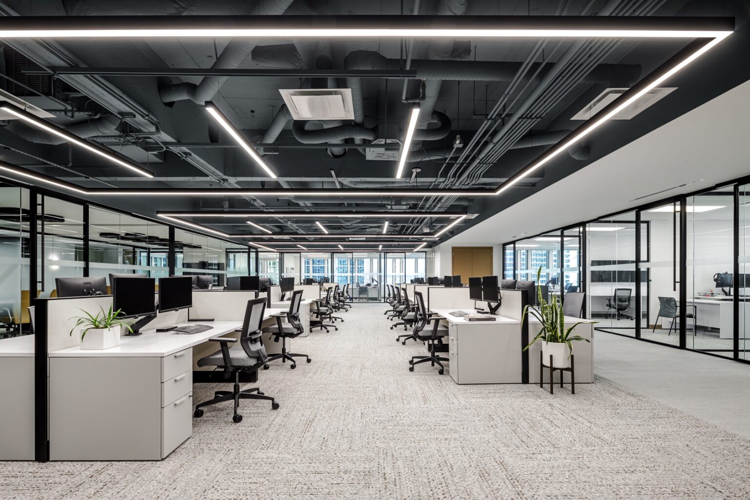
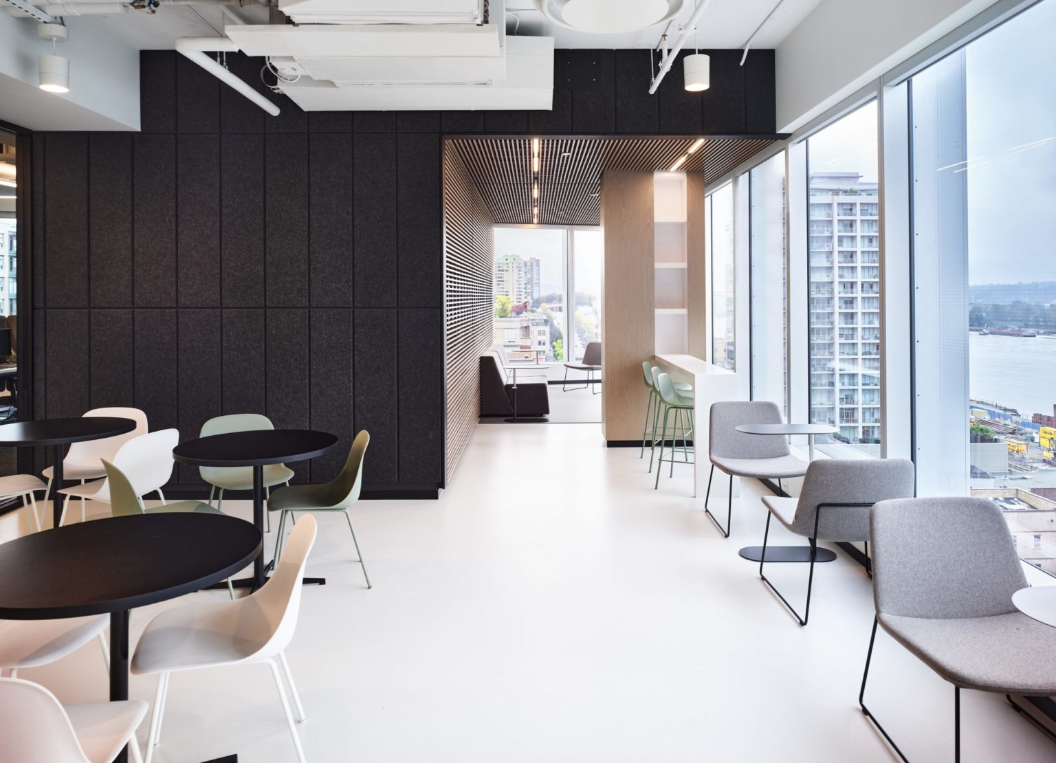
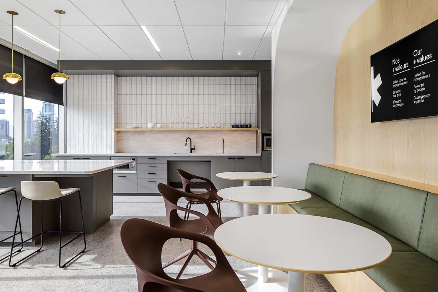
On the 5th floor, Key Marketing’s space encourages staff to work in various, casual settings while also showing off the culture and expertise of the company. Both private work spaces and collaborative open lounge areas were incorporated to serve the diverse team’s functions.
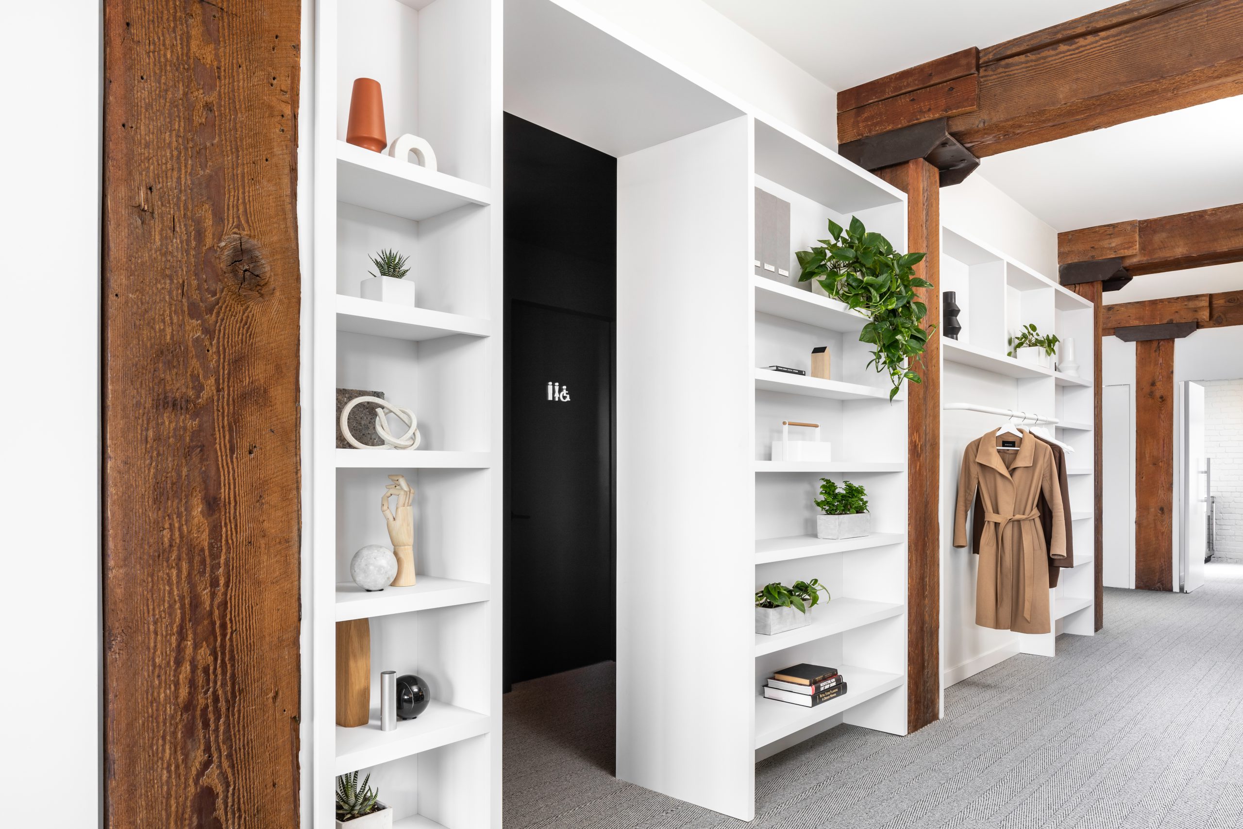
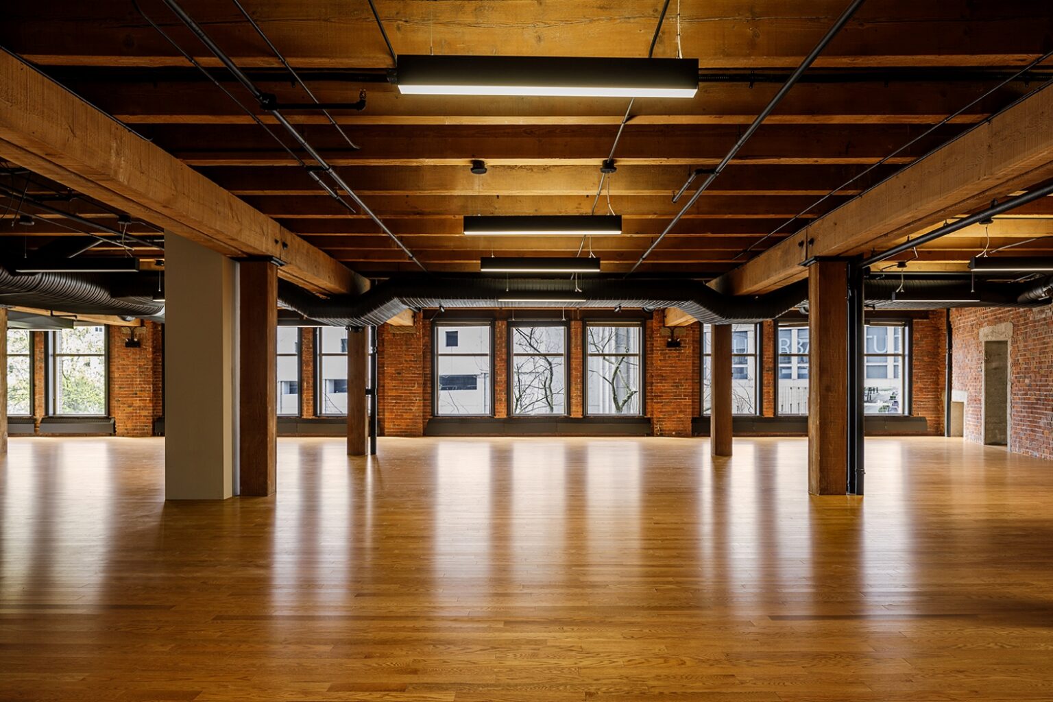
Preserving the integrity of the building’s historic architecture was essential to the new design of this office. A few key materials, finishes and fixtures were chosen to intentionally look and feel like they had always been there. We were able to procure several of these items ourselves, from bespoke light fixtures to hand woven Turkish accent pillows, ensuring that the vision came together even in the smallest details.
One of the things we love about these spaces is how different they are. They are in the same building and have the same floor plate. Although their shells are the same, their interiors have been developed to fit their unique personality and functions.


