Our Role
A travel agency is a unique retail environment in that the product isn’t exactly tangible; what they’re selling is an experience. As such, the Customer Journey is essential to the success of the business. For us, that meant assessing how well environmental cues contribute to an individual’s sense of wanderlust. The space needs to encourage customers to, not only take the trip, but put their trust in the service provider. Therefore, our goal was to combine key elements, indicative of travel, that would create touch points reminiscent of the destination itself.
We provided Interior Design services, including project management and procurement for Flight Centre’s Concept Store design at Coquitlam Centre. Our involvement began at pre-design and followed through to design development, construction documentation, and contract administration during construction.
Our Approach
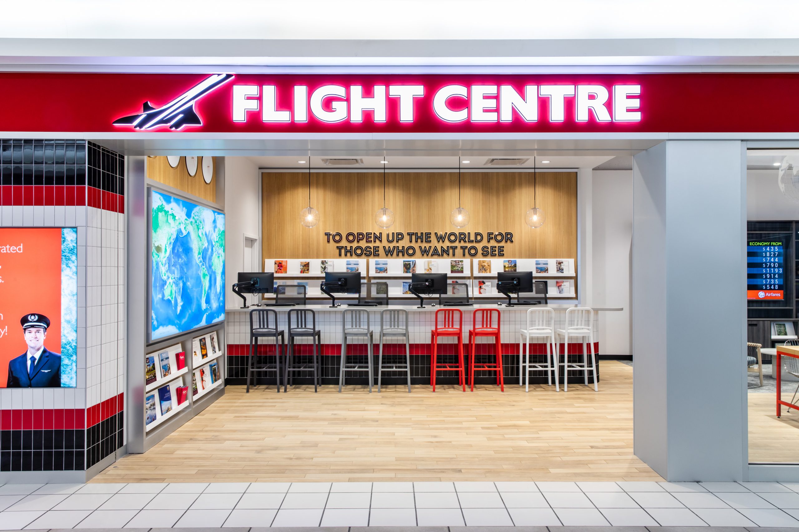
The Flight Centre’s wide storefront provides the perfect opportunity to spark intrigue and wonder in passersby. Nostalgic travel cues such as tiles inspired by train station corridors, an integrated billboard, and full-height glazing with vertical mullions work to capture customers’ attention and evoke past travel memories. The framing of the entrance is equally inviting. Much like the quintessential silhouette of palm trees overlooking the beach, it beckons you in, while allowing casual observers to easily take note of the latest offers and come back in the future.
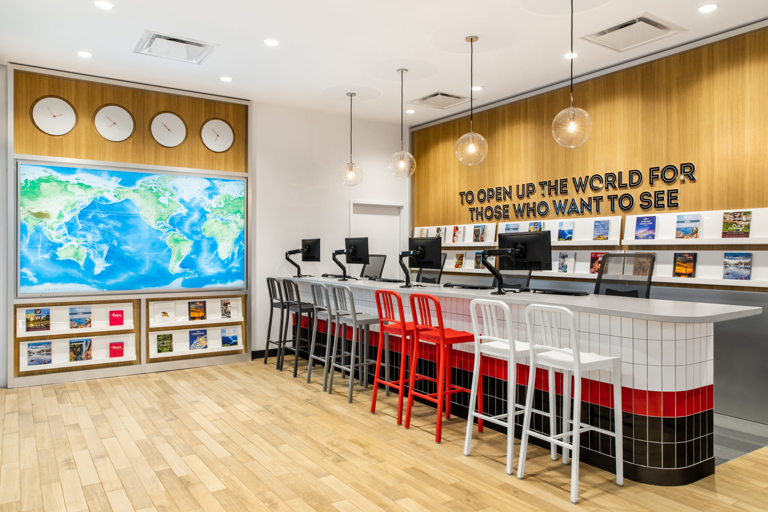
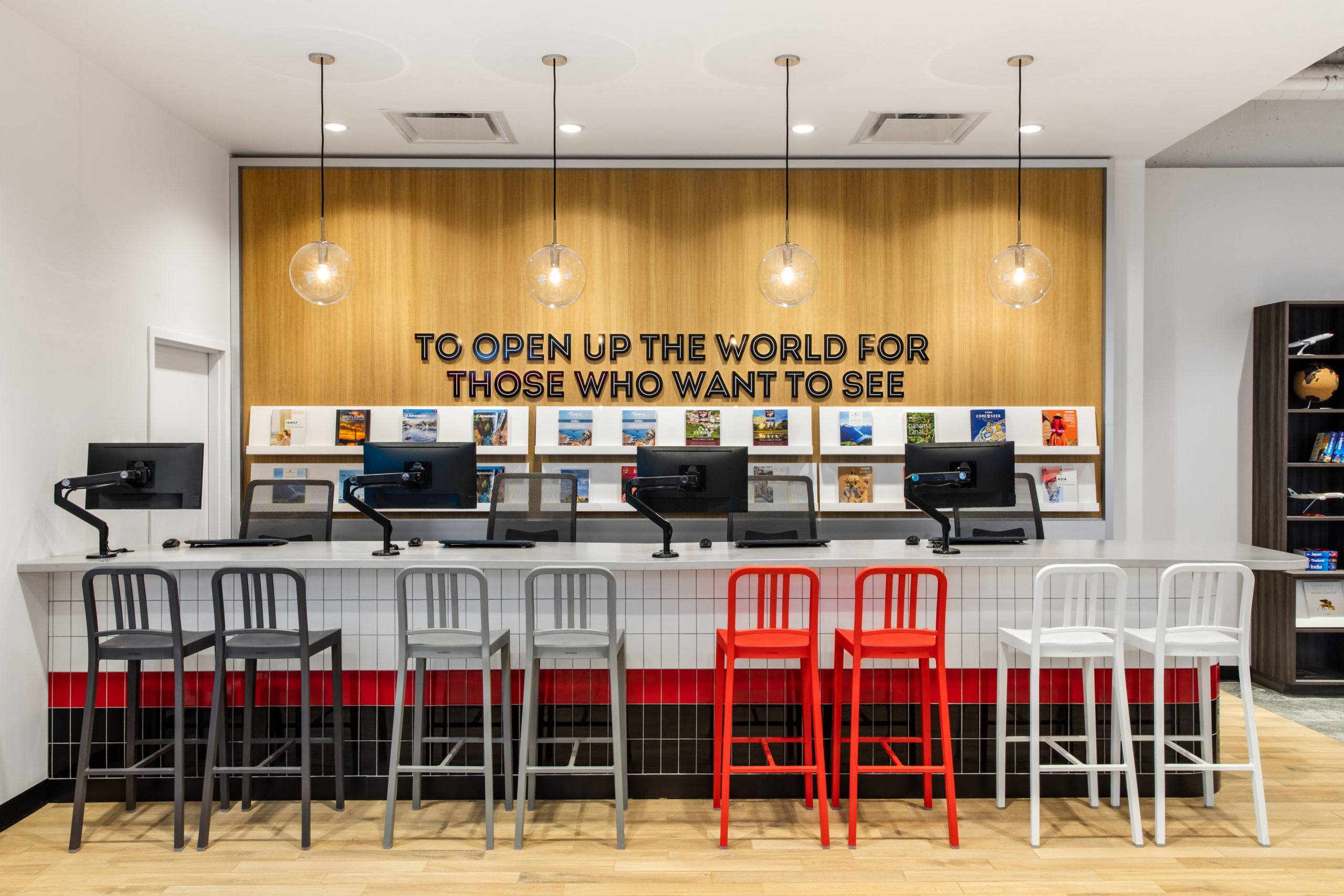
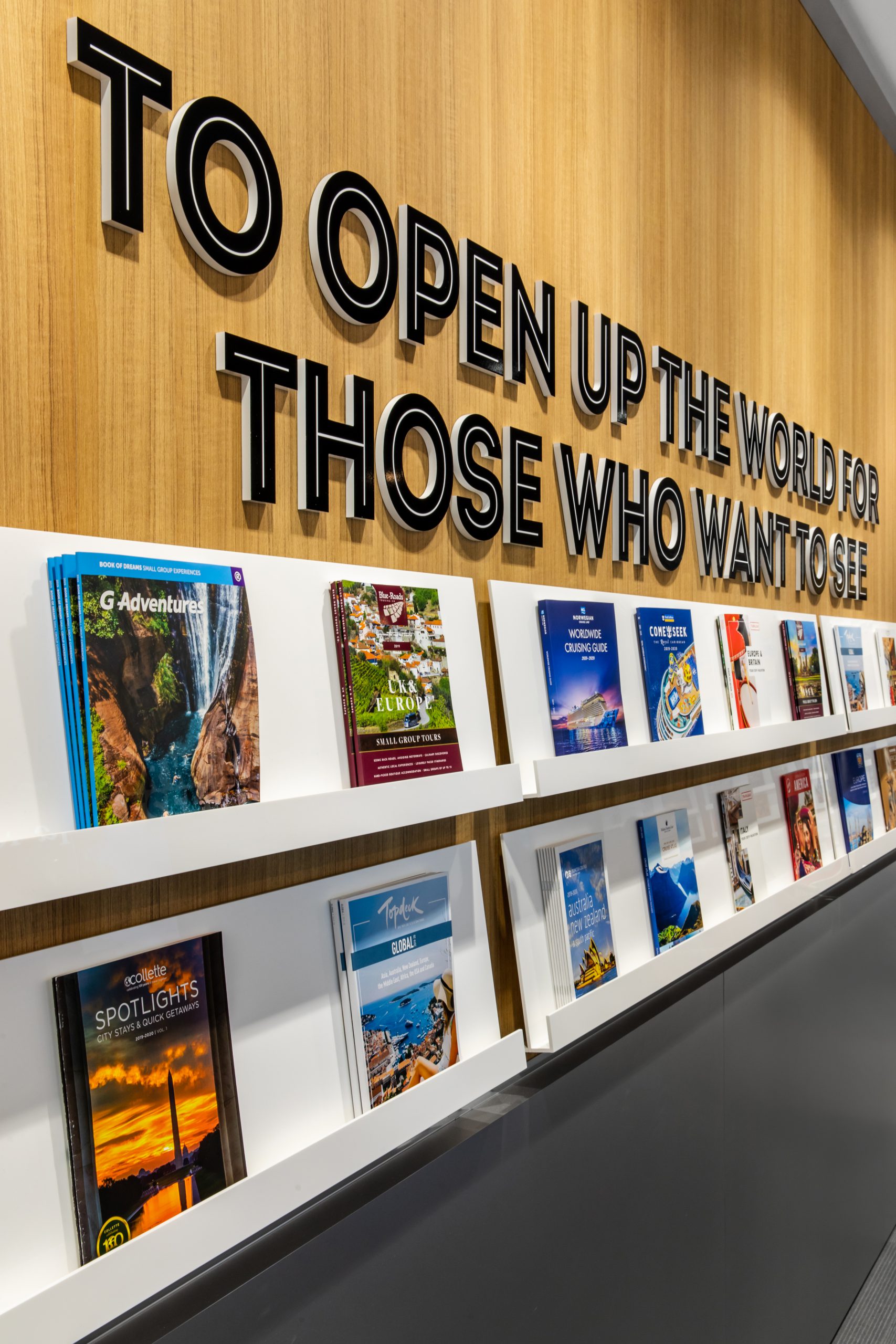
Upon entering the space, customers are met with inspirational signage and captivating visuals. The Flight Centre’s slogan — “To Open Up The World For Those Who Want To See” — is prominently displayed behind the travel information bar, making their purpose clear as you’re welcomed into the space. The glow of the clear spherical pendants against the wood millwork evoke a warm, casual ambience. Using the information travel bar as the backdrop, also helps set the tone for the hospitality-like experience customers can expect.
Adjacent to the travel bar is the Flight Centre’s iconic back-lit writable scribble map — an interactive site where customers can obtain information prior to speaking with a travel expert. This area encourages exploration as the customer can create their own journey within the store, letting their imaginations take them around the world.
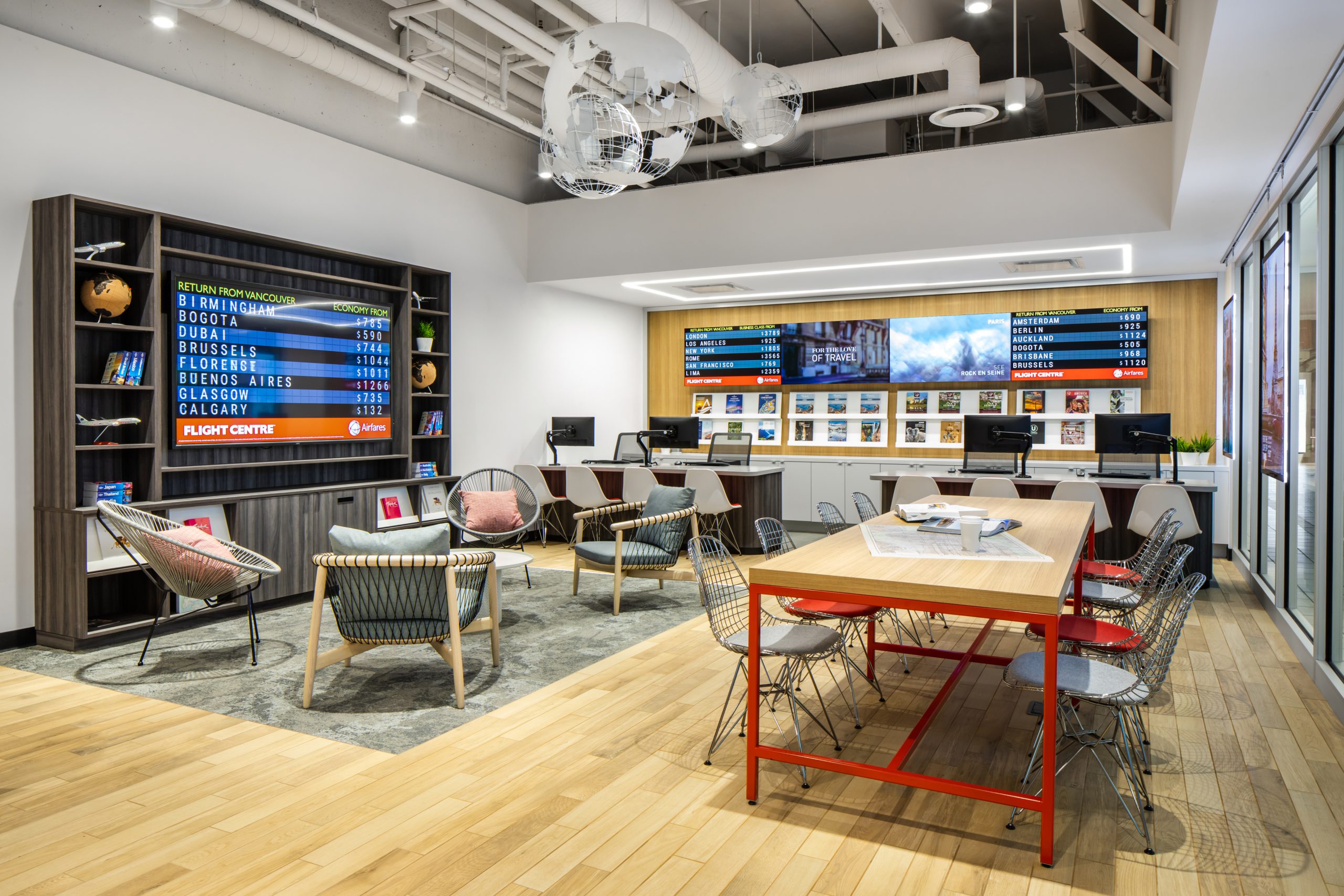
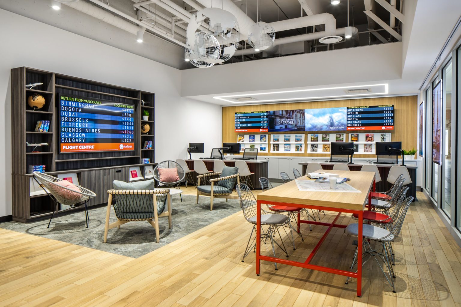
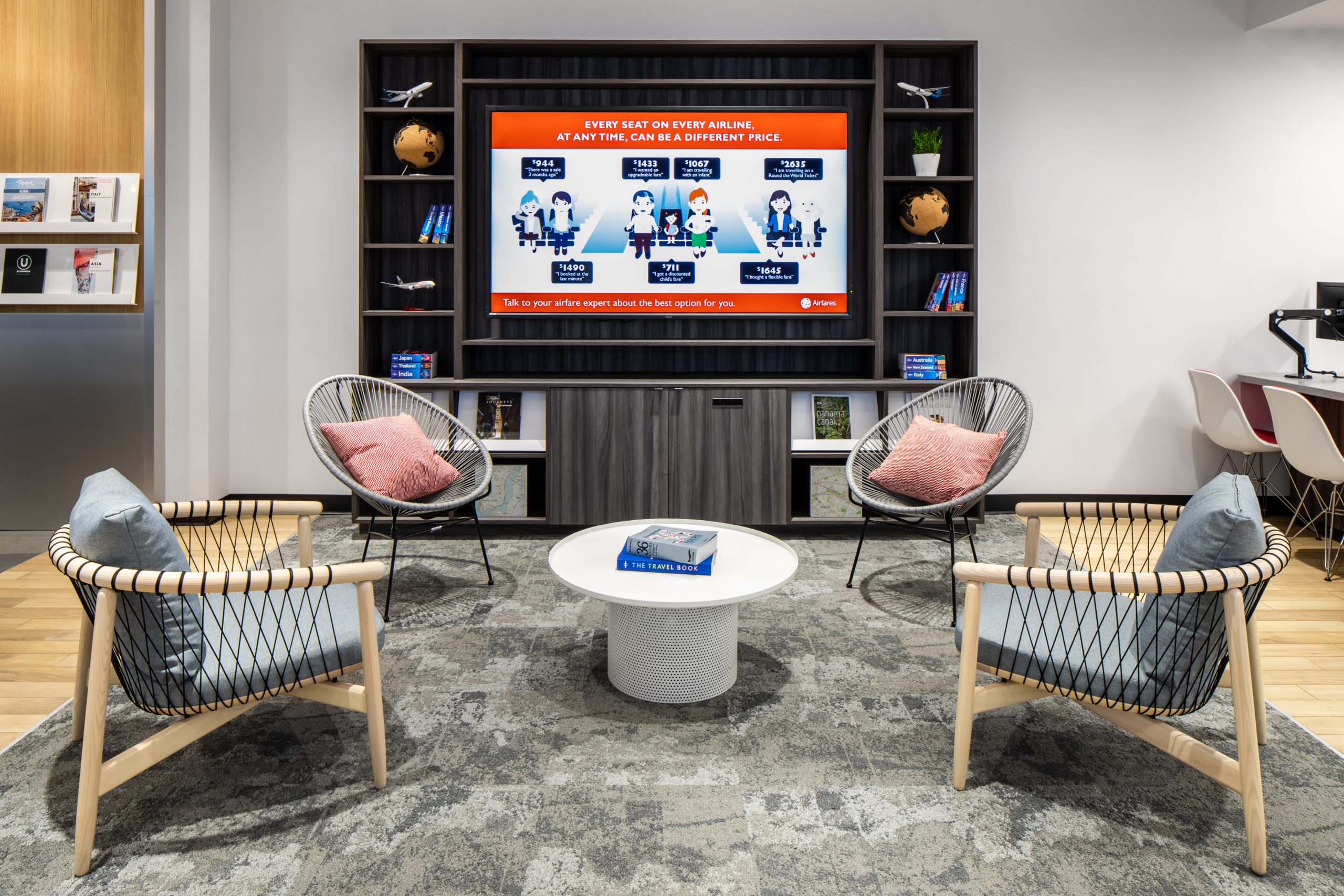
Three large, wireframe globe sculptures hang below the exposed ceiling designating the lounge area. Located next to the initial open space customers encounter after retreating from the chaos of the mall, the lounge is subdued and inviting. It’s also fully equipped with a travel library bookcase complete with integrated brochure displays and an inspiration screen for those who require further research or inspiration. Embracing Flight Centre’s paradigm of collaboration and information sharing, the lounge area is peppered with seats reminiscent of notable resort furniture and large community table. Here customers can not only plan their trip at their leisure, they have the opportunity to share ideas and inspiration with others as well.
The consultation desk is tucked against the back wall, framed by a suspended ceiling with integrated linear lights, acting like a beacon to engage, and an inviting combination of soft curves, warm stone and wood surfaces. Behind the waiting consultants is the departure board. Housed in a lovely wooden millwork unit, the board provides customers with both visual inspiration and information about the latest deal and hottest destinations. Like a hotel or airport check-in, this area provides a more focused, one-on-one experience, tailored specifically to the individual.


