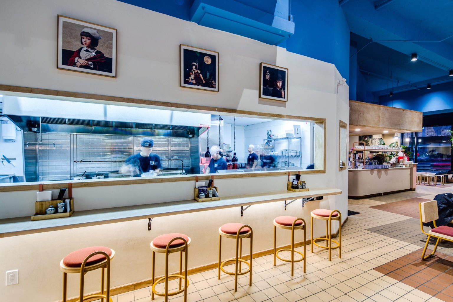
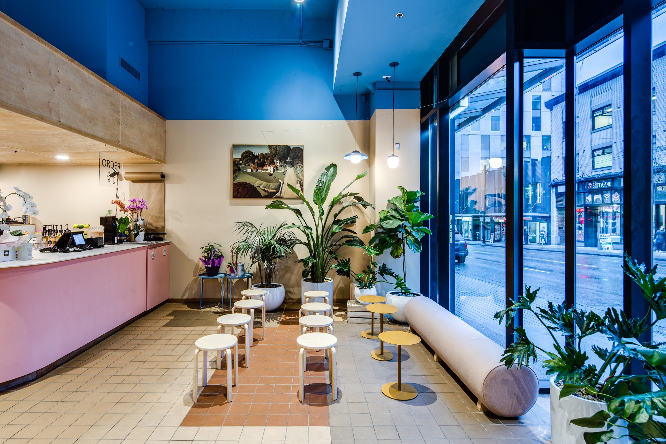
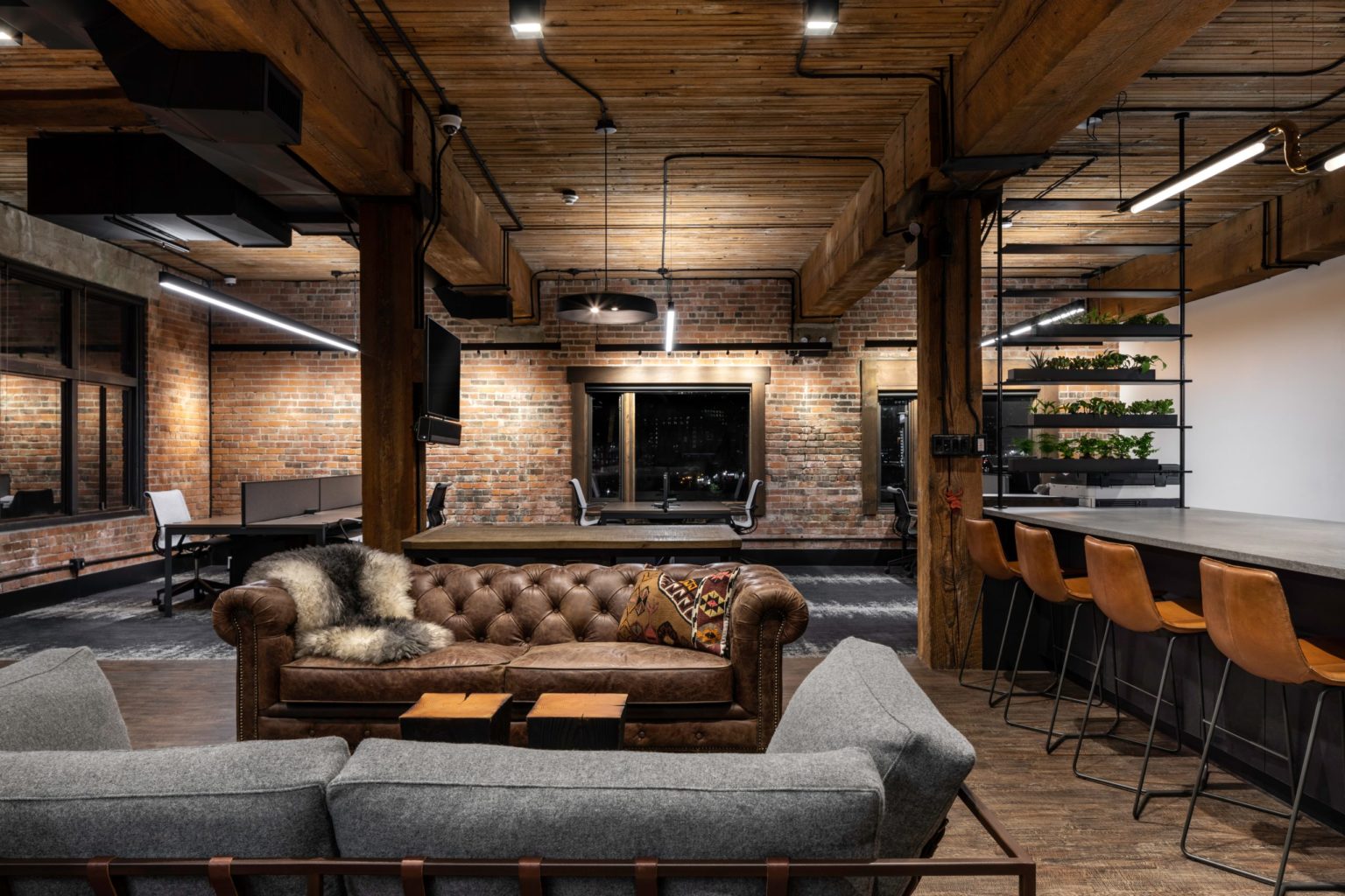
When mapping out the design of this space, we pulled reference from traditional forms of Japanese joinery. Raw materials like wood and fabric were used to create a timeless and simple design that exudes warmth and comfort throughout the 3,344 sq ft. eatery. The simplicity of the materials and forms used allows the space to be filled with life – whether it be through the people interacting within it, or the food being served.
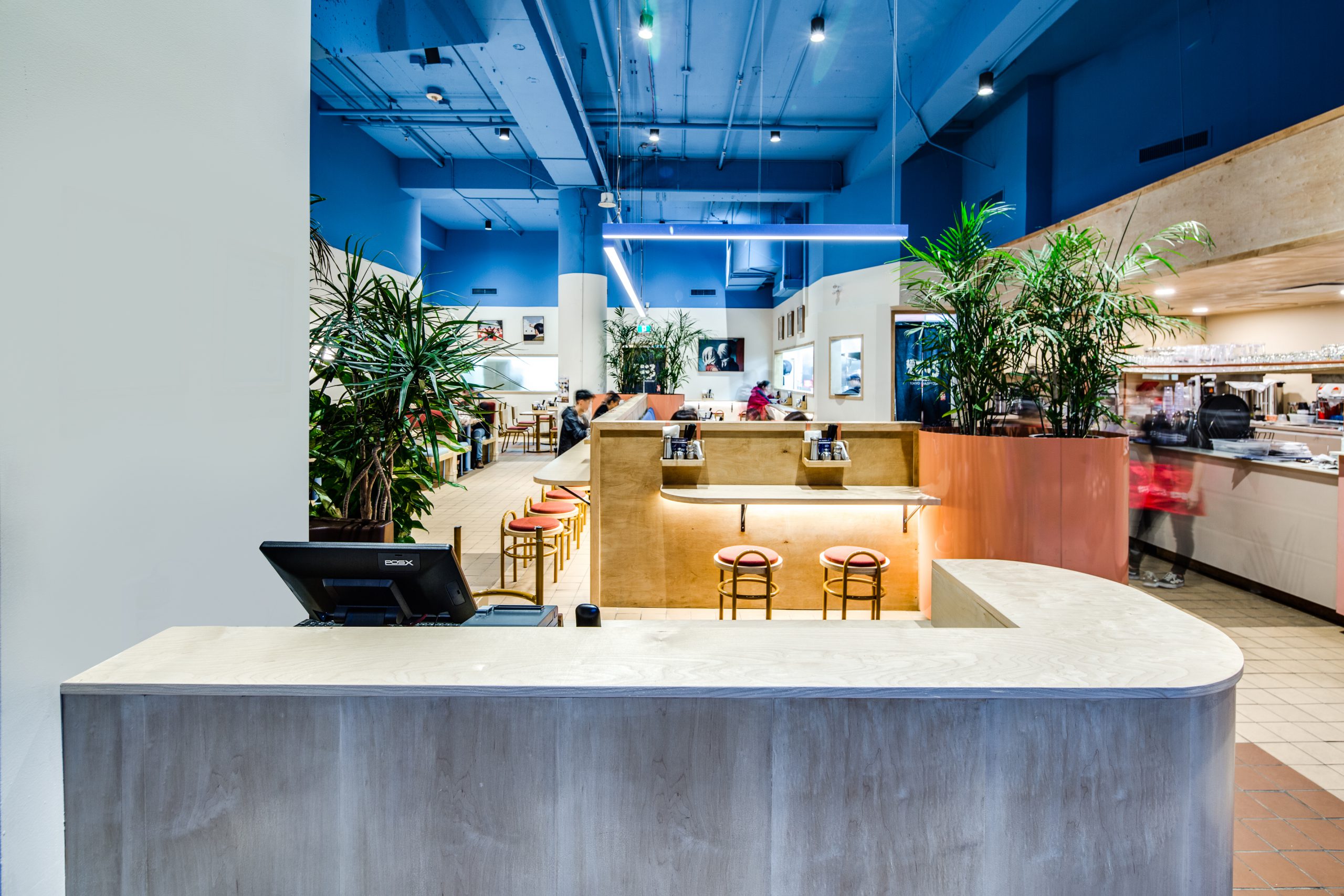
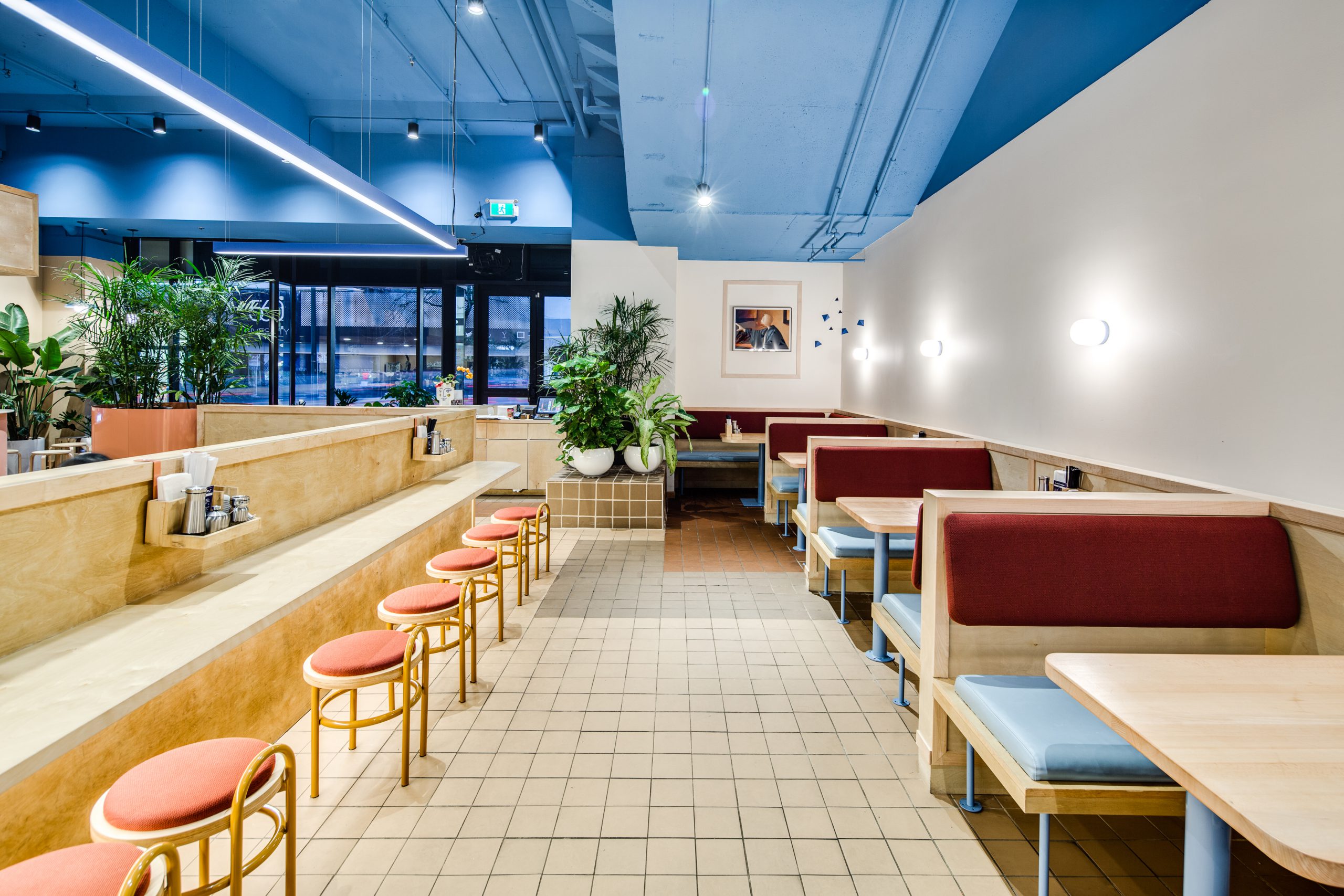
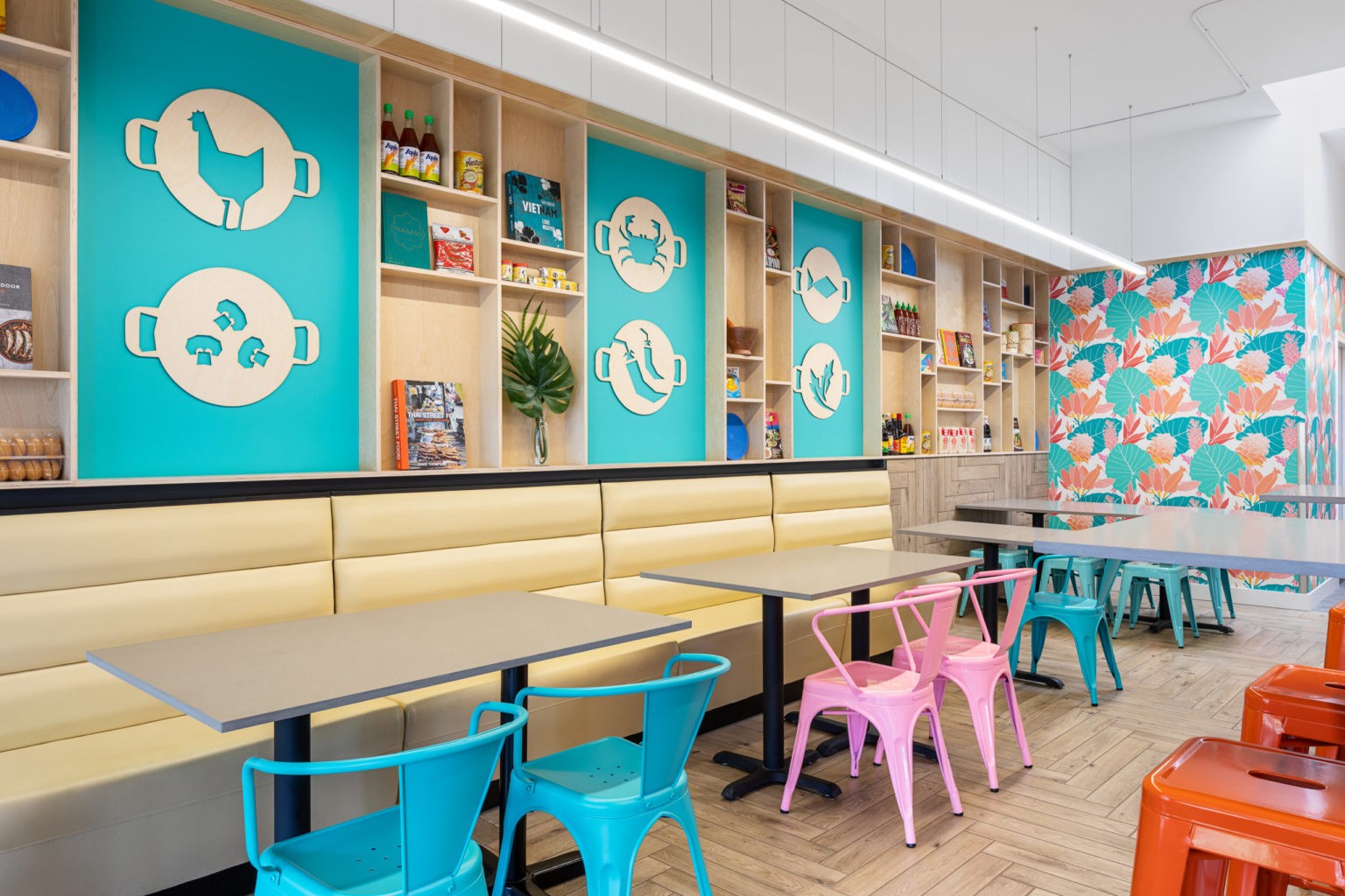
Though KOKORO hails from Japan, we wanted to infuse the space with local charm to make it more accessible and inviting to locals. To achieve this, the colour palette was derived from the qualities of the natural materials used, then applied to the context of Vancouver. The space also features areas that allow people to connect on a more personal level. Counter, booth and even lounge areas were designed for various types of interaction, to make the restaurant a social destination point in Vancouver.
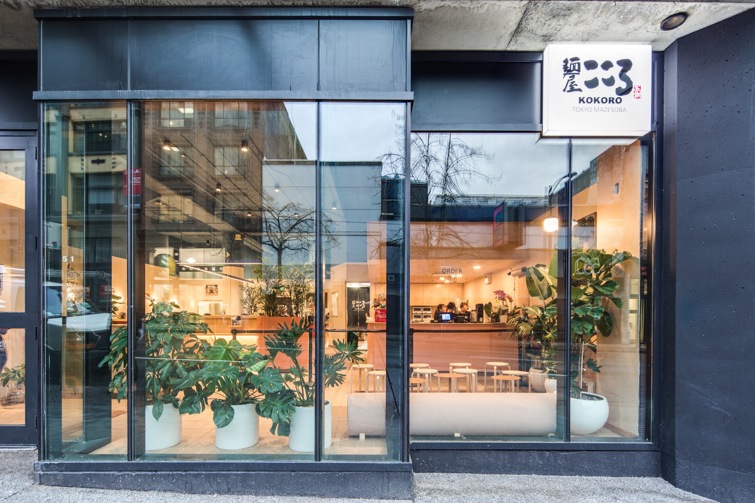
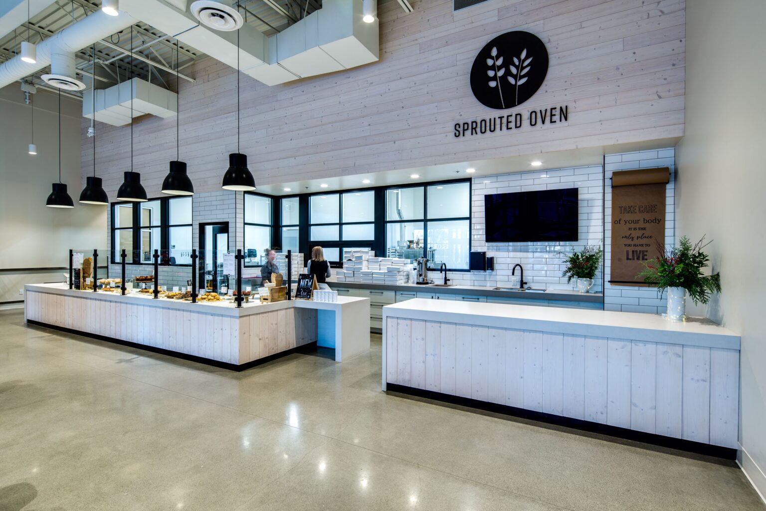
As a space that moves from day to night, we envisioned a warmth glowing from the interior. To compliment the natural aura of the space, we used dimmable lighting from Mac’s II and Inform, along with a variety of light wood tones to welcome customers when they arrive at the door.
Upon arrival, customers are eased into a natural flow throughout the space. This was achieved with smooth, curved forms and wood furniture which speaks to the simple yet refined utilitarian aesthetic of the space.
To bring the room to life, and further compliment the experience, we brought in authentic colours and organic materials. Cool tones of blue and indigo balance the warmth and are incorporated throughout the space in the delicate yet durable fabrics and upholstery.
KOKORO mazesoba serves up food that is both unique and comforting. We feel lucky to be a part of sharing it with the city we reside in.


