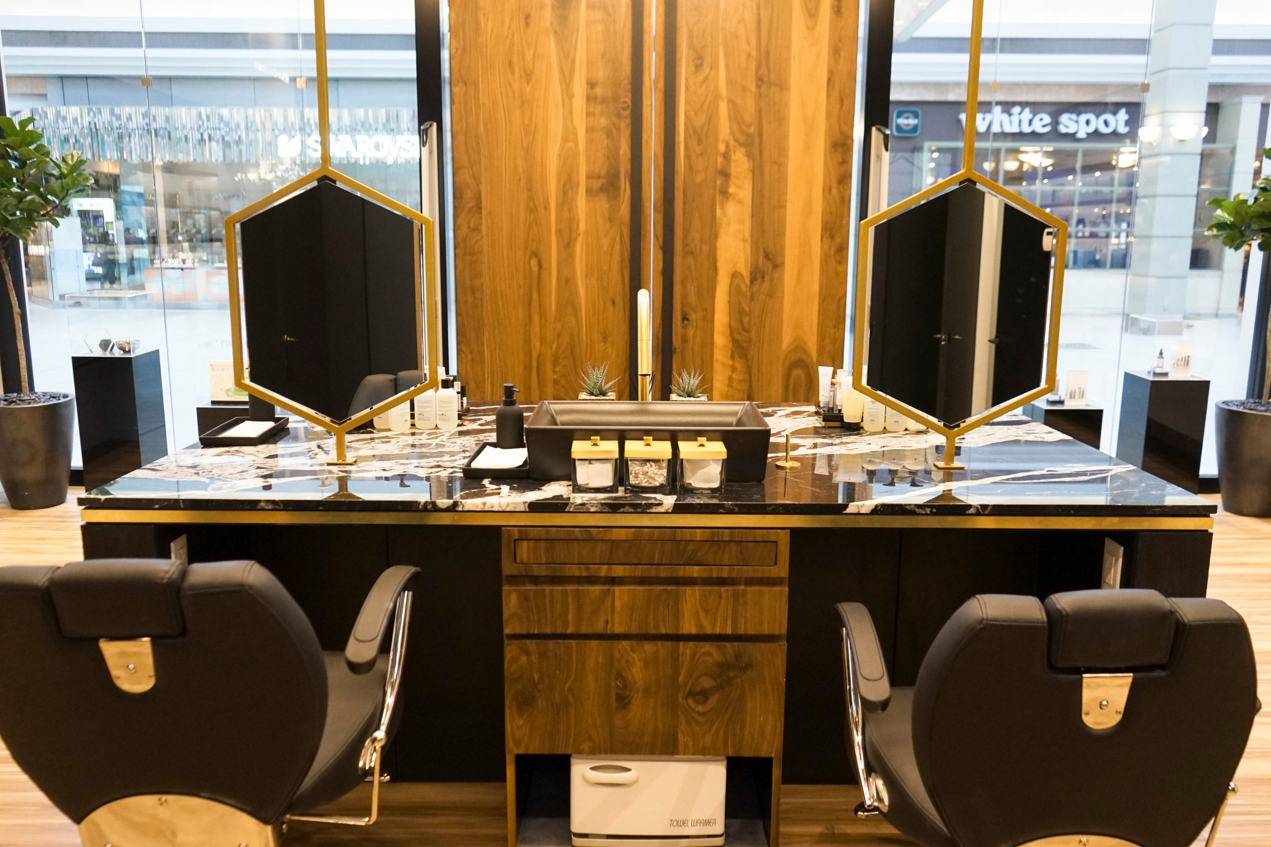
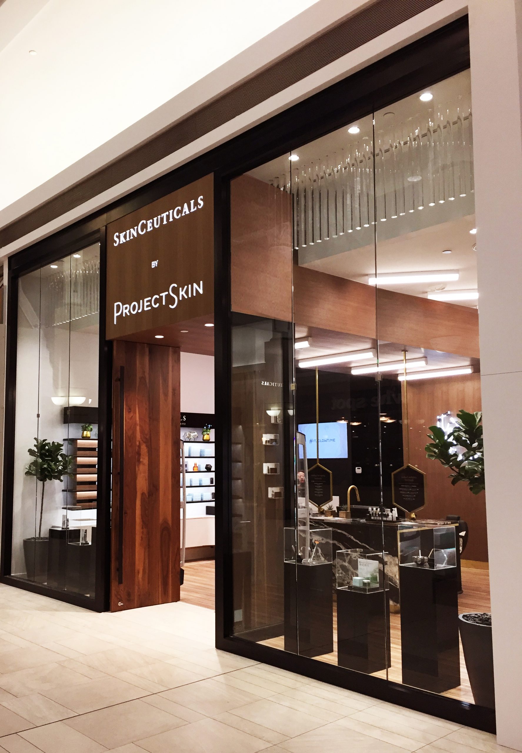
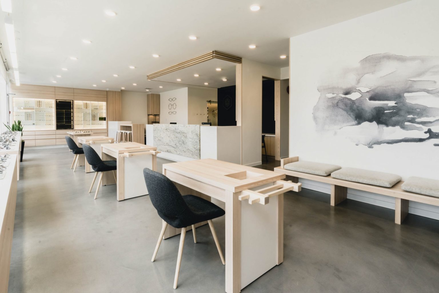
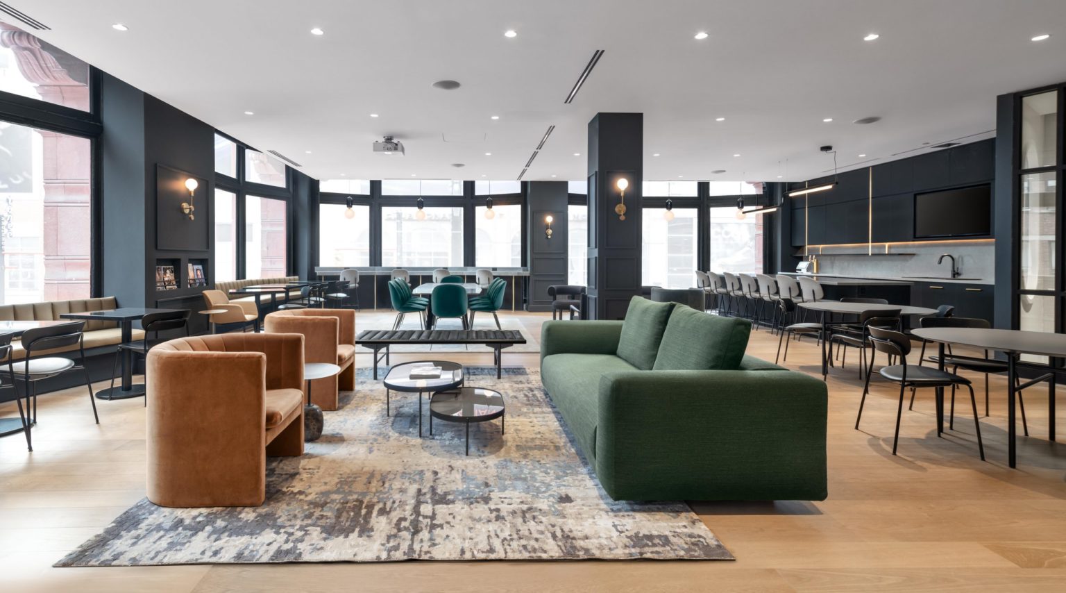
Since educating clients about the health and beauty of their skin is such a large part of what the Project Skin team does, the space is designed for thoughtful interaction at every turn.
Customers are offered warm tea to sip as they make their way through the store and encouraged to take their time testing out the different products or selecting whichever express facial peel is right for them.
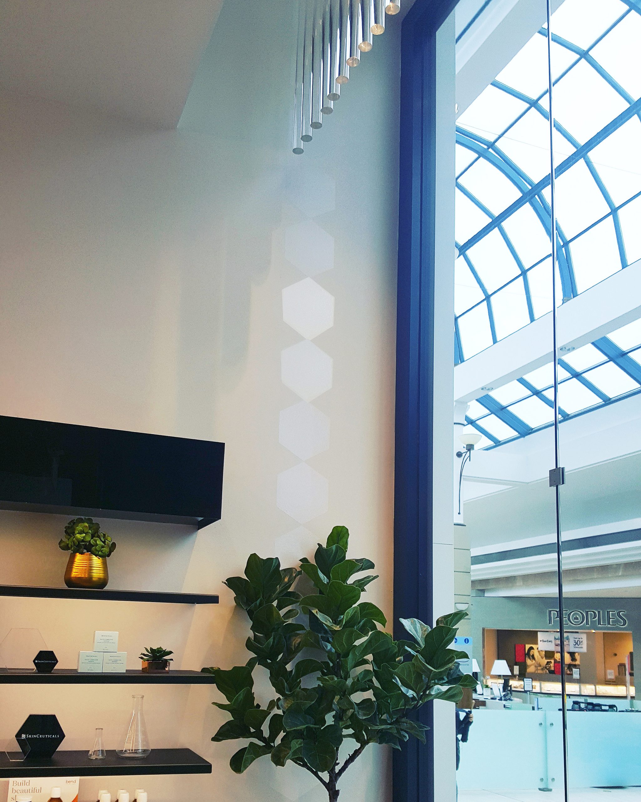
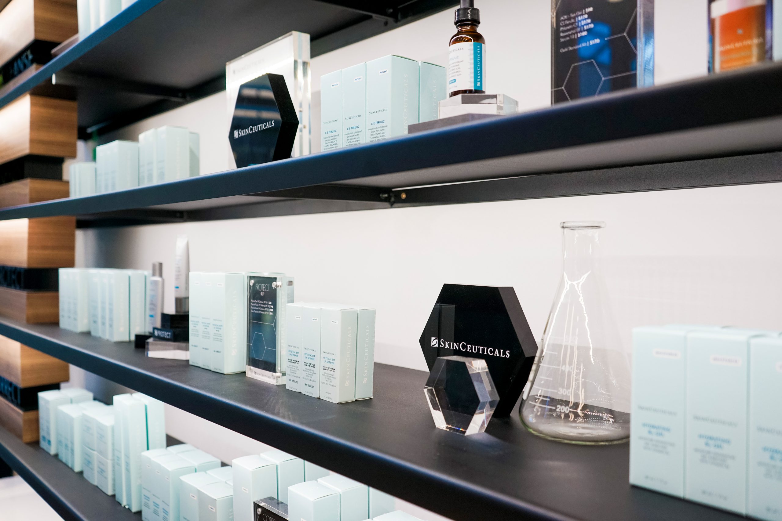
Translucent tubes, suspended from above, represent the purity of clear skin as well as communicate the clinical aspects of the SkinCeuticals scientifically-backed formulas with the token symbolic laboratory vials and beakers throughout the displays. Black walls with trimless doors and black hardware in the back half of the space create a clean lined and serene atmosphere for clients to retreat to for services.
It’s the small moments and details that work together to create a larger piece that conveys the overall feeling of beauty when you walk in. Whenever someone looks in a mirror we want them to glow.
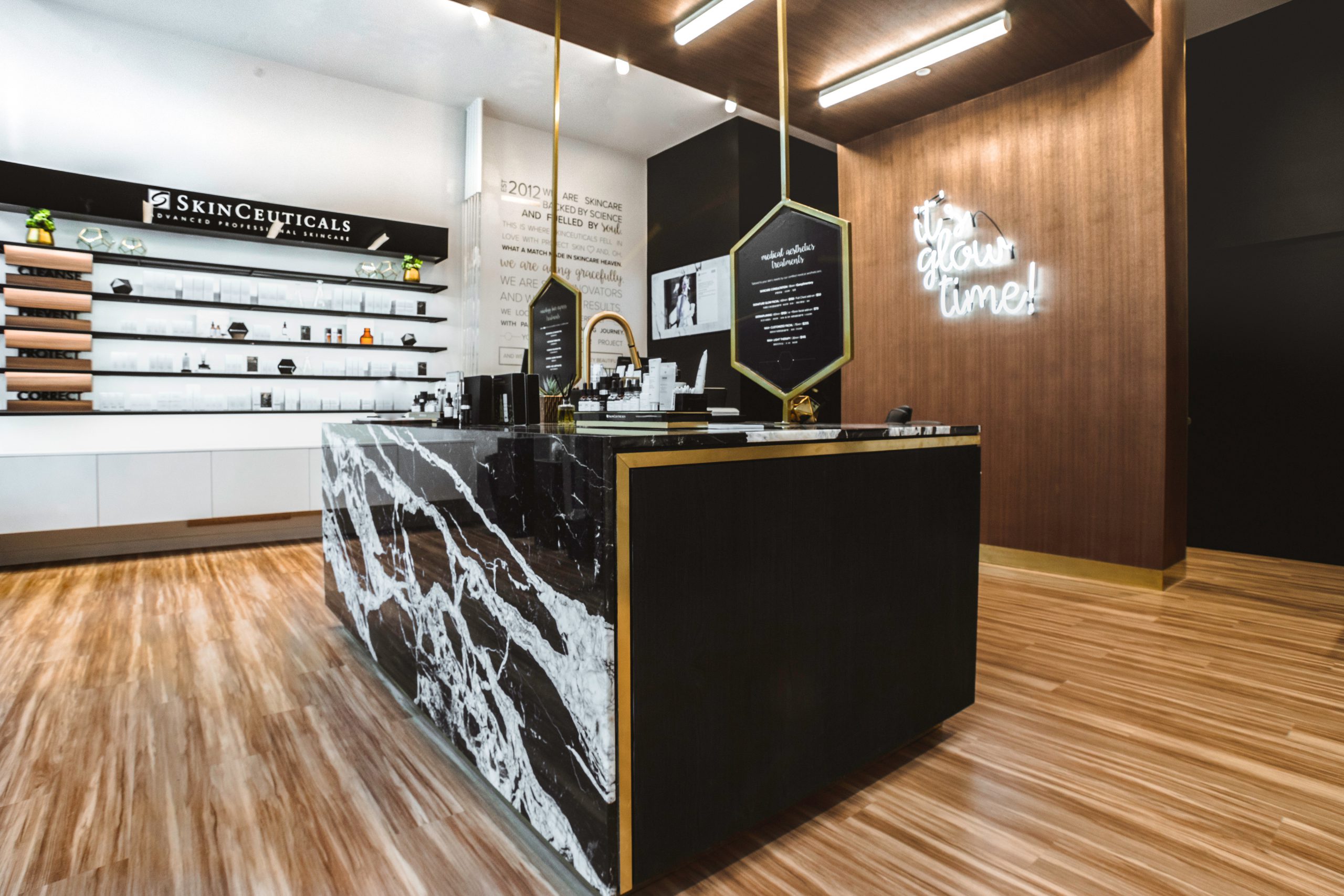
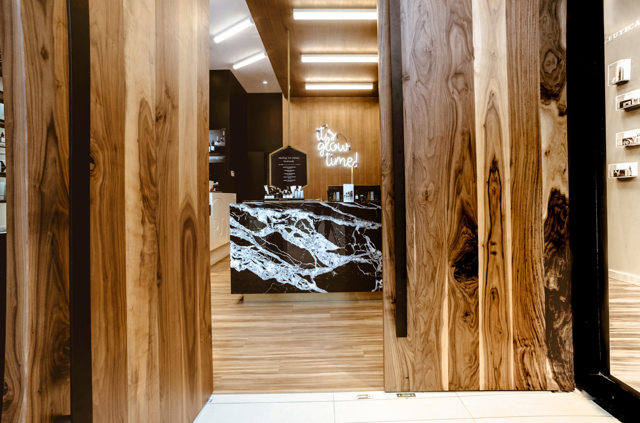
The vertical vinyl line of the SkinCeuticals hexagon flanks the entry in a way that catches the natural light from the glass-roofed atrium of the mall, subtly imitating the gleam of fresh, glistening skin. While, “Get your glow on” shines in neon on the feature wall, emphasizing the Project Skin mantra and feature point of the space.
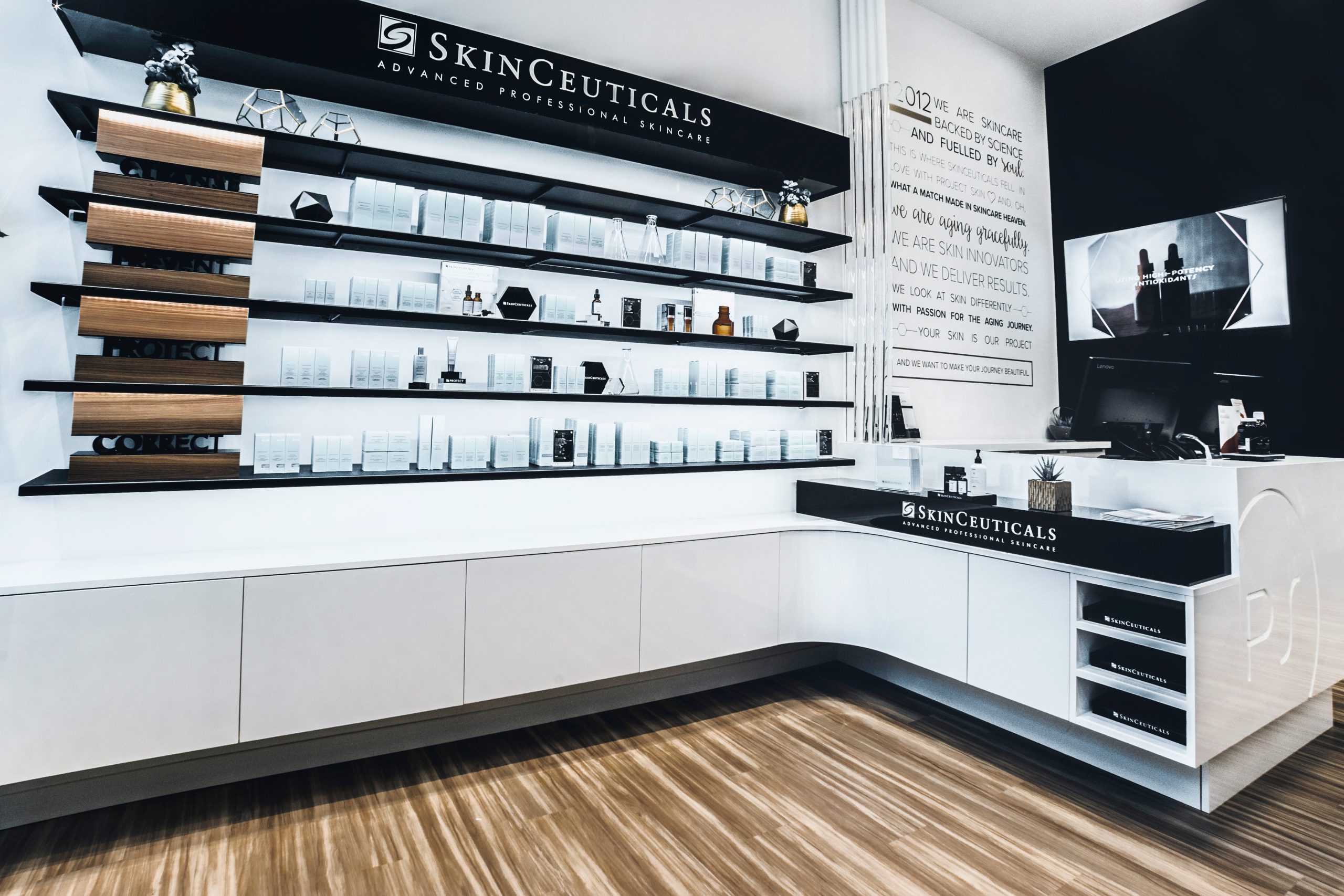
The primary goals of SkinCeuticals and Project Skin’s services are: Cleanse, Prevent, Protect and Correct. We matched the same delineation in the materials and finishings of the physical layout.
3D signage is displayed on the lit perimeter shelving to categorize the products into the four pillars of the brand. Two recessed TV screens, with custom looping media, offer further interactive product education for each category and the ‘mini-must haves’ bar, situated next to the cash desk, are merchandised within the brands four groups, allowing customers to easily grasp what each product is designed to do when filling their jewelry tray with a-lá carte items.
From the slab of marble in the centre island to the solid walnut doors that mark the entryway, the materials we chose for the space are classic. The impressions people leave on them over time will be a testament to their functionality, never a lack or loss of their luster. In fact, the unique qualities of the wood and stone are not unlike that of skin. While they may be smoothed and refined, the true beauty of these materials is in their natural irregularities, textures and grains that will only get better with age.


