Our Approach
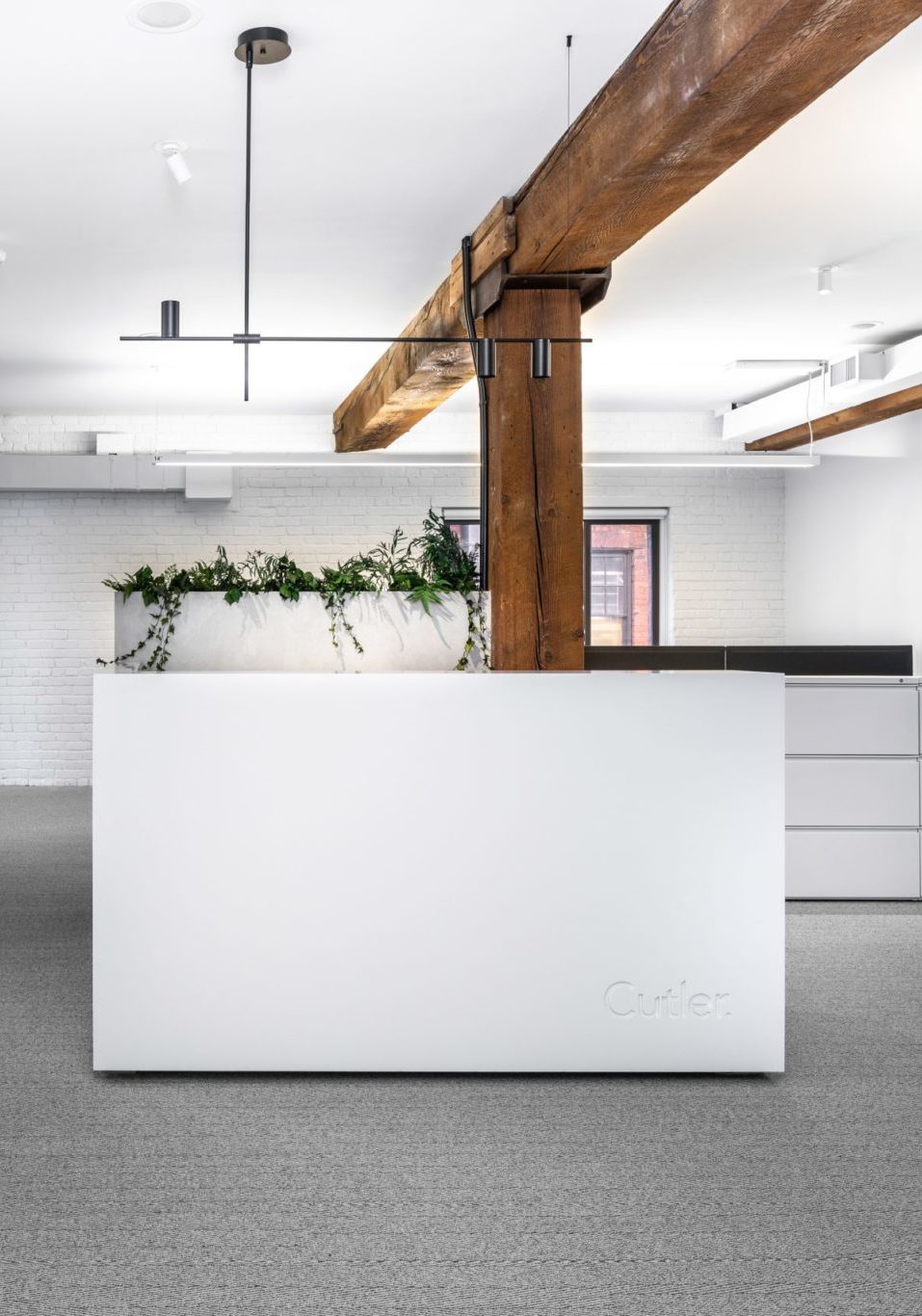
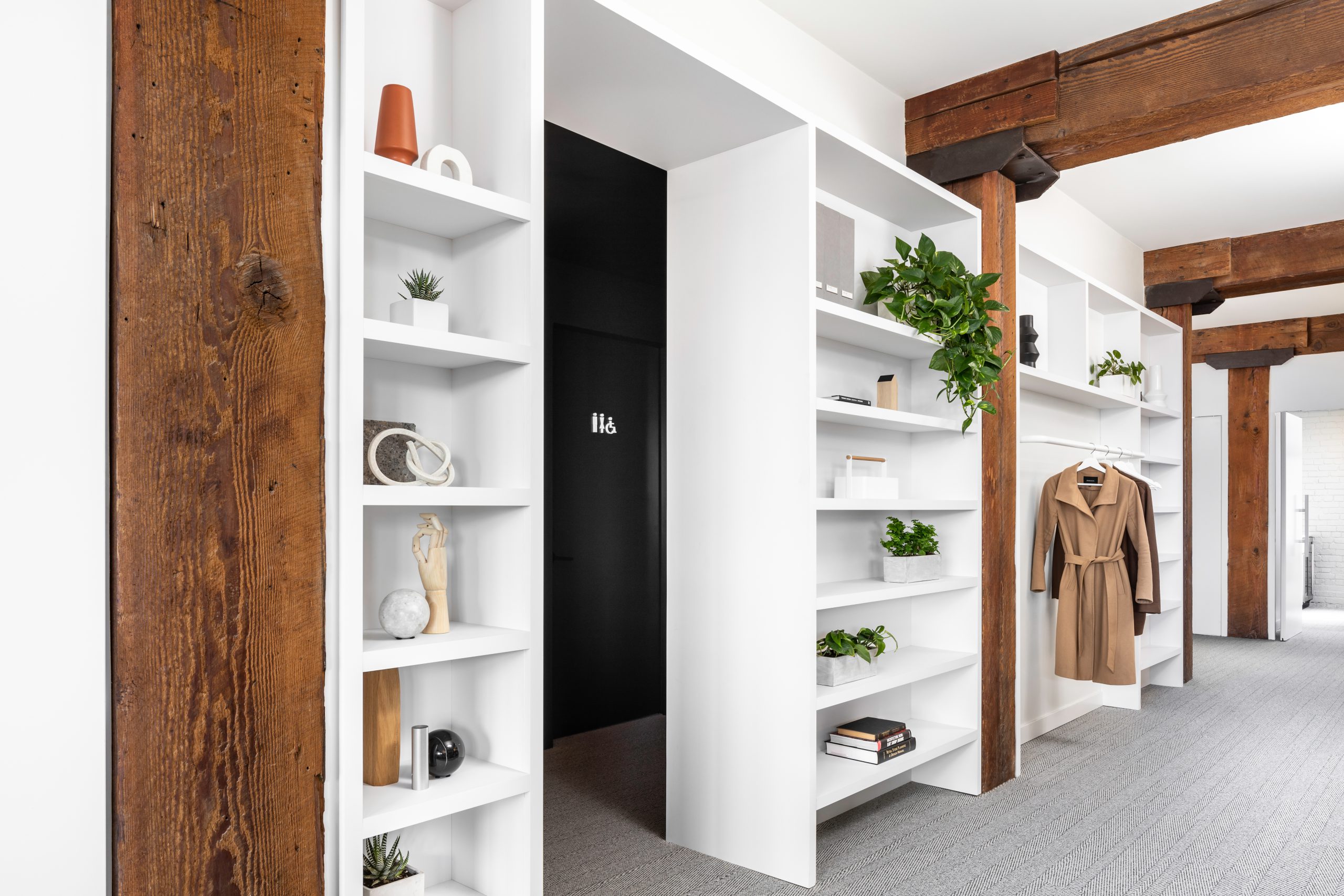
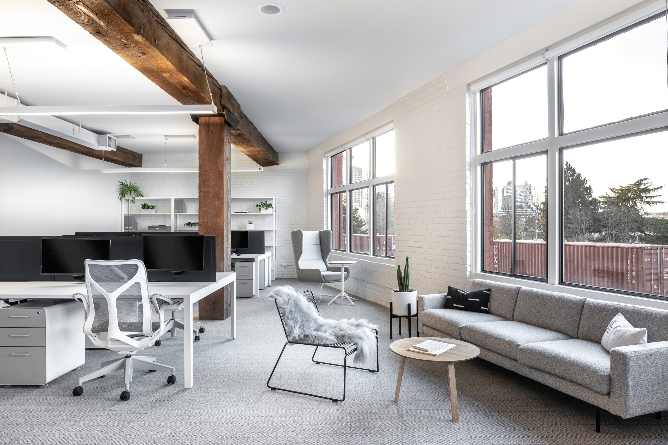
Embracing the Old-World charm of the existing space, our new design works to preserve and highlight the exposed brick and heavy timber construction. Conceptually we envisioned a modern, loft-like feel with an urban flare and laboratory-esque aesthetic connoting the depth of our research and creativity. As such, the foreground of the space appears as a blank white canvas outfitted with all the tools our team needs to grow and feel inspired.
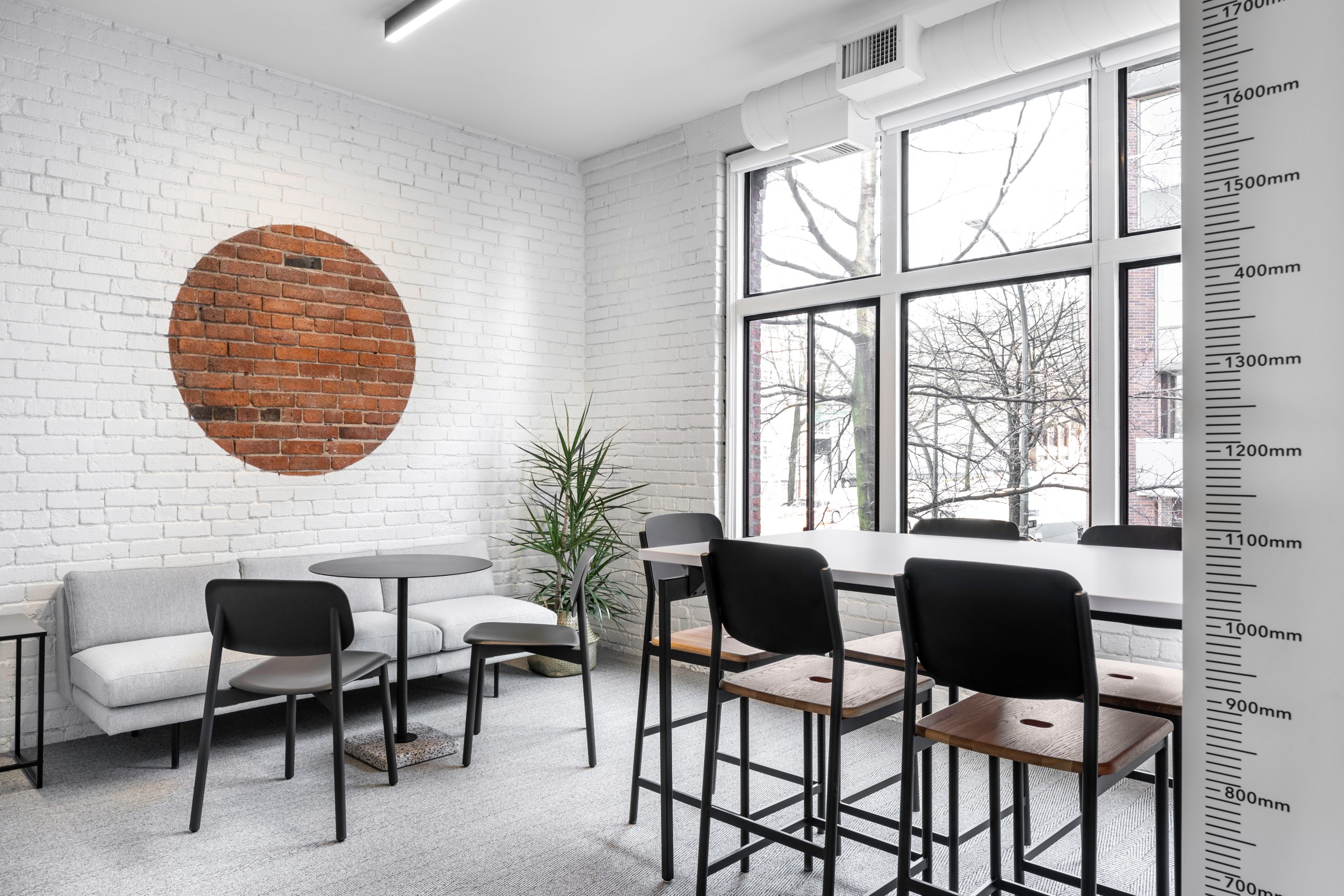
Sticking to timeless, simple finishes and neutral colours, a minimalist palette eliminates unnecessary visual distractions. We chose to paint the existing brick white in order to maintain the textural integrity of the architecture while modernizing the space with a lighter, brighter feel. A circle of unpainted brick is left exposed in one meeting room as a quiet nod to the history of the building. We also incorporated a series of vinyl graphics throughout that play with the actual scale and square footage of the space. Elements like the large format tape measure on the corner wall not only refers to the sense of measured precision so closely tied to what we do, it’s a functional reference point the team can actually use.
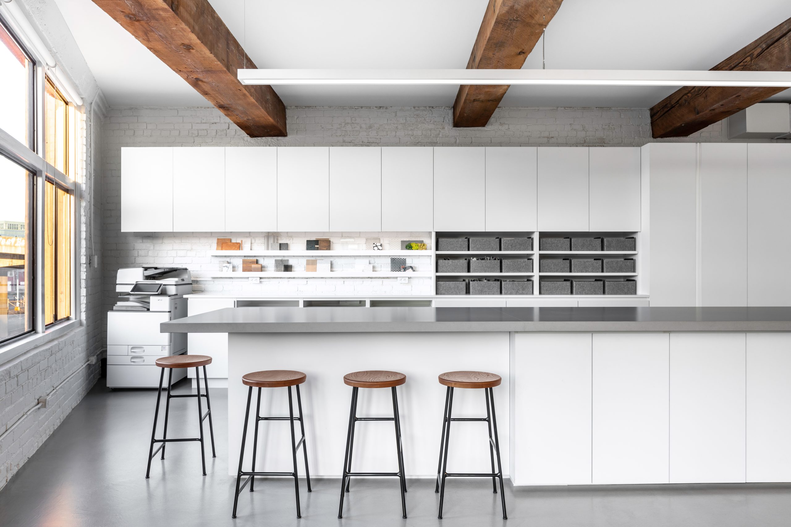
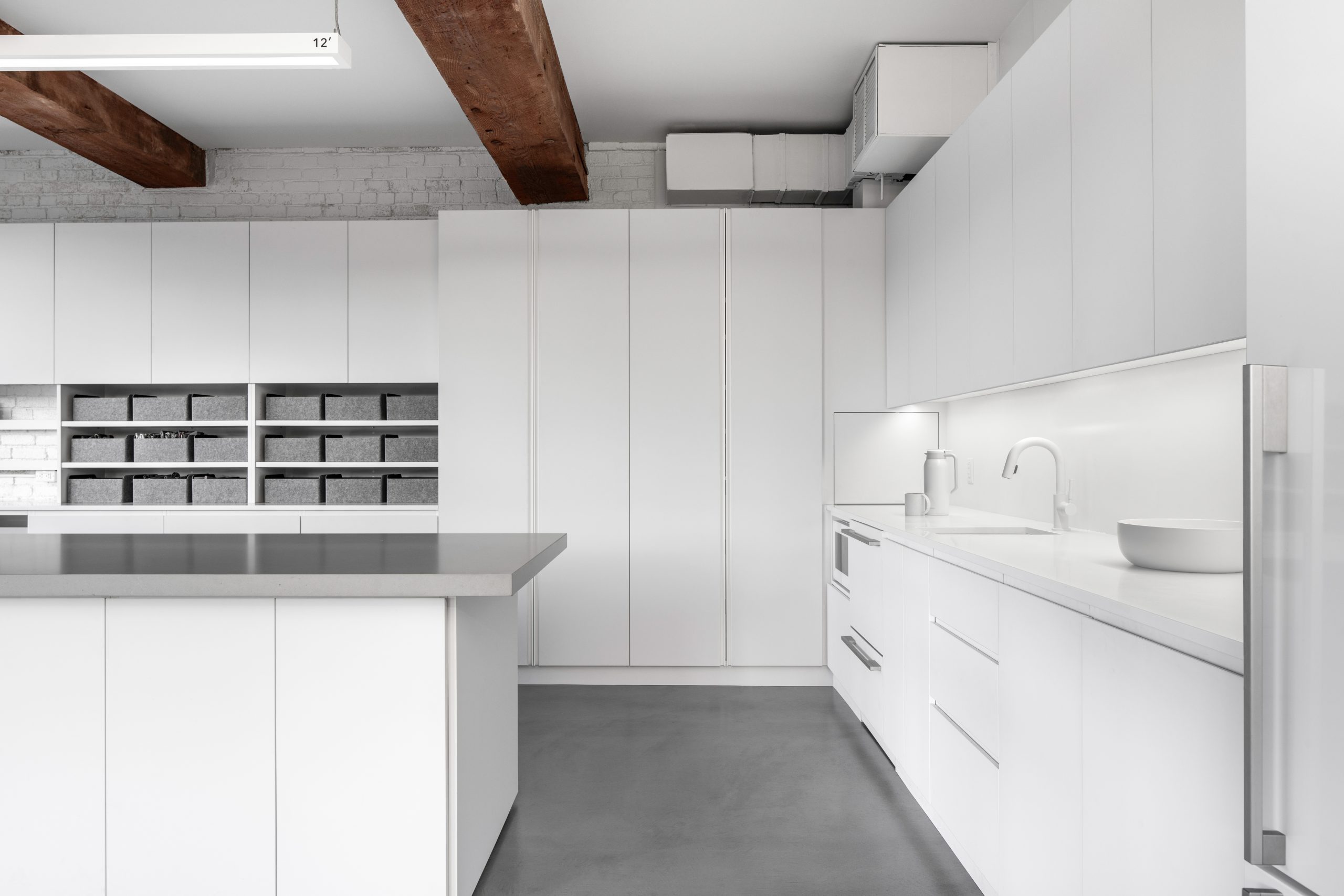
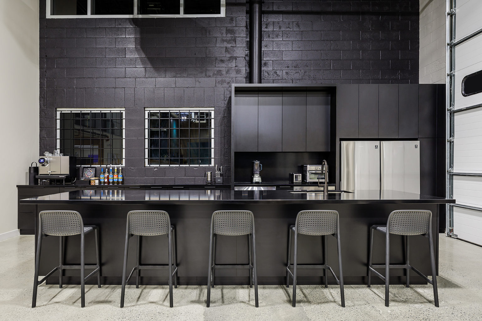
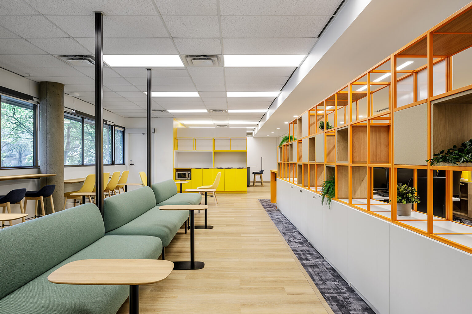
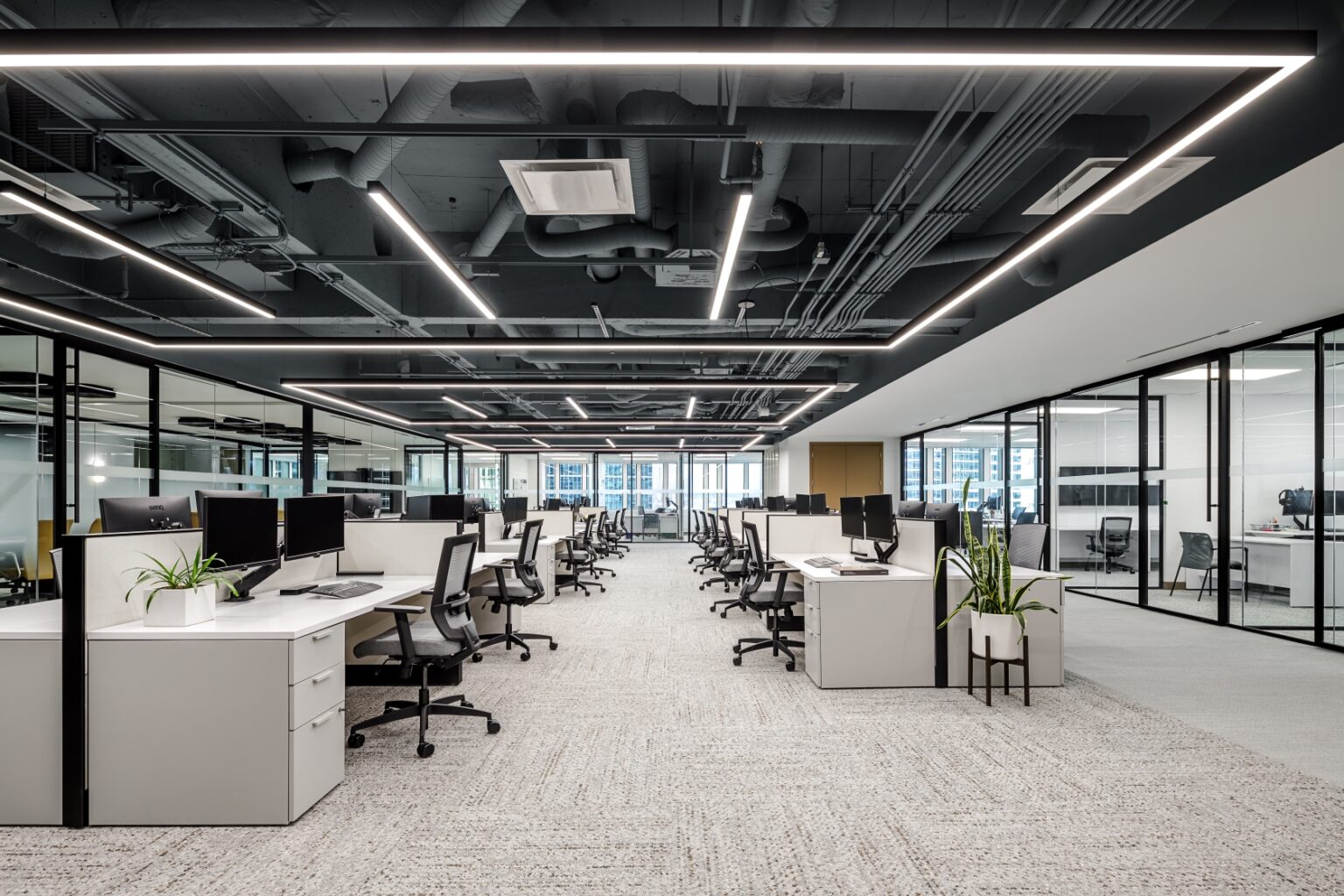
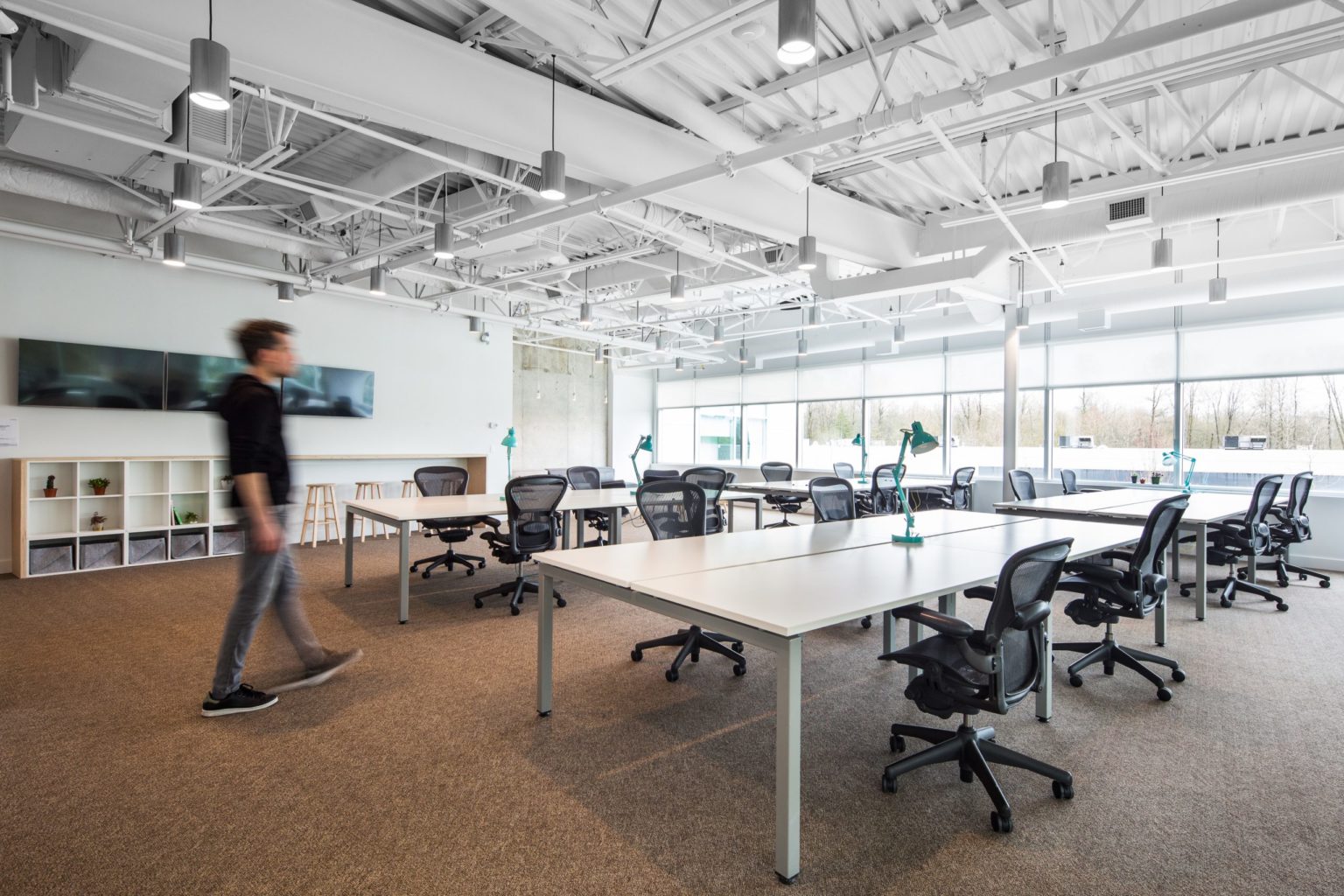
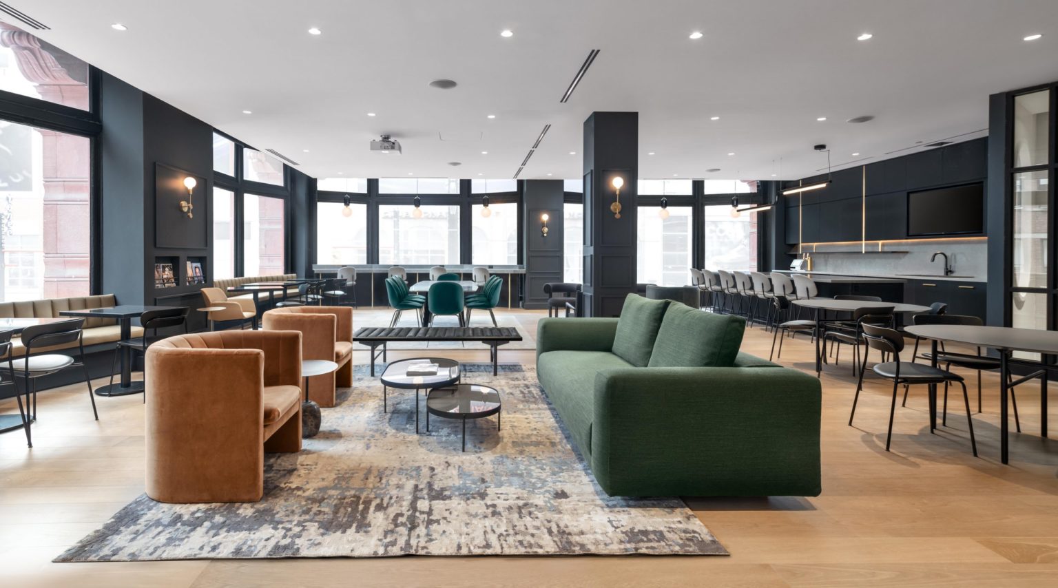
The main stretch of bench desks in the center of the space merges the quiet South side of the office with the more social North side and ensures the incredible mountain views are accessible from all areas. The staff hub is situated in the North East corner of the space and combines the staff kitchen with the material library. An immense island brings the two spaces together and can be used for a variety of functions, from collaborative gatherings and social events to an enlarged workspace for laying out larger materials and finishes. The furniture was also specifically selected to offer varying heights and comfort levels to encourage movement and, whether standing or lounging, minimize the stasis of sitting at a desk all day.
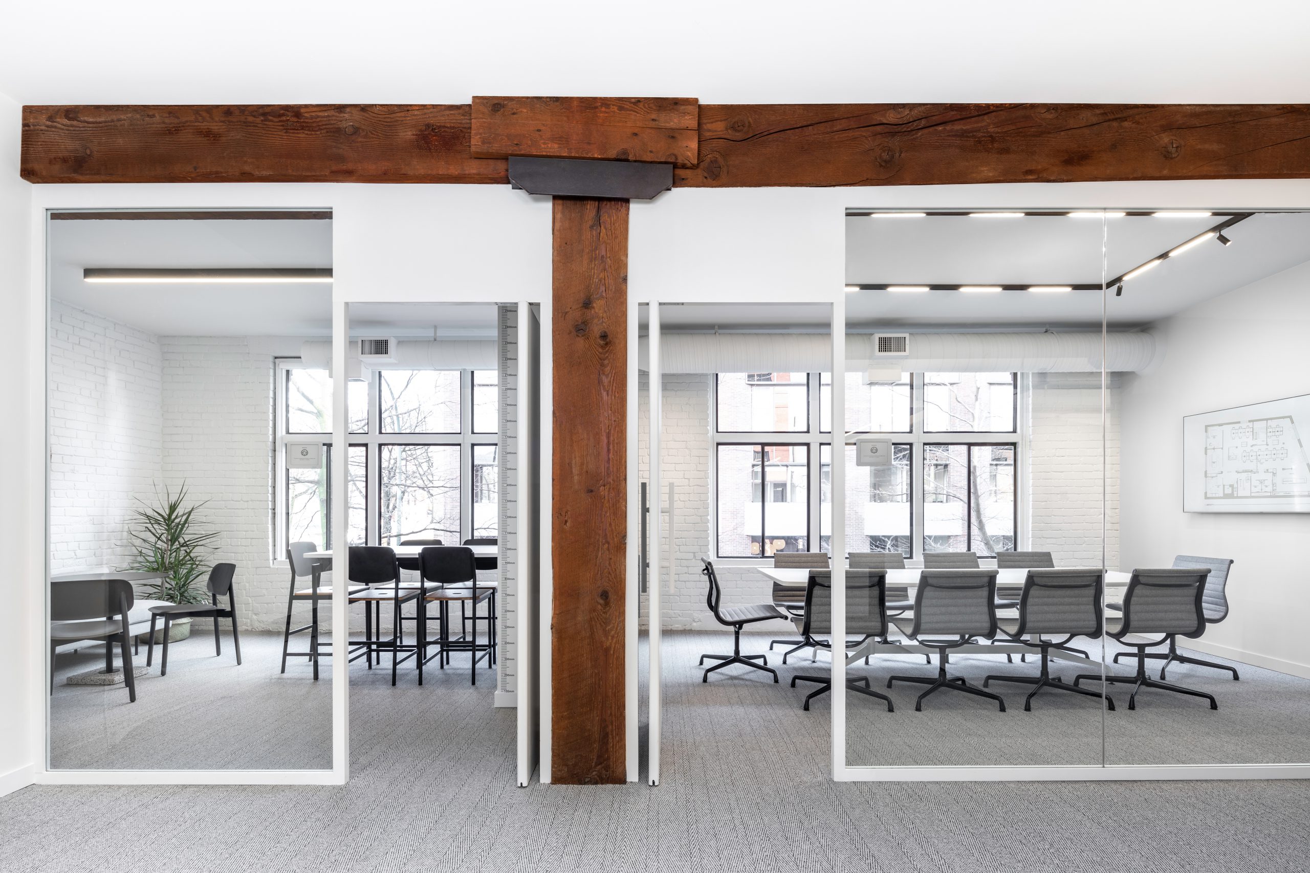
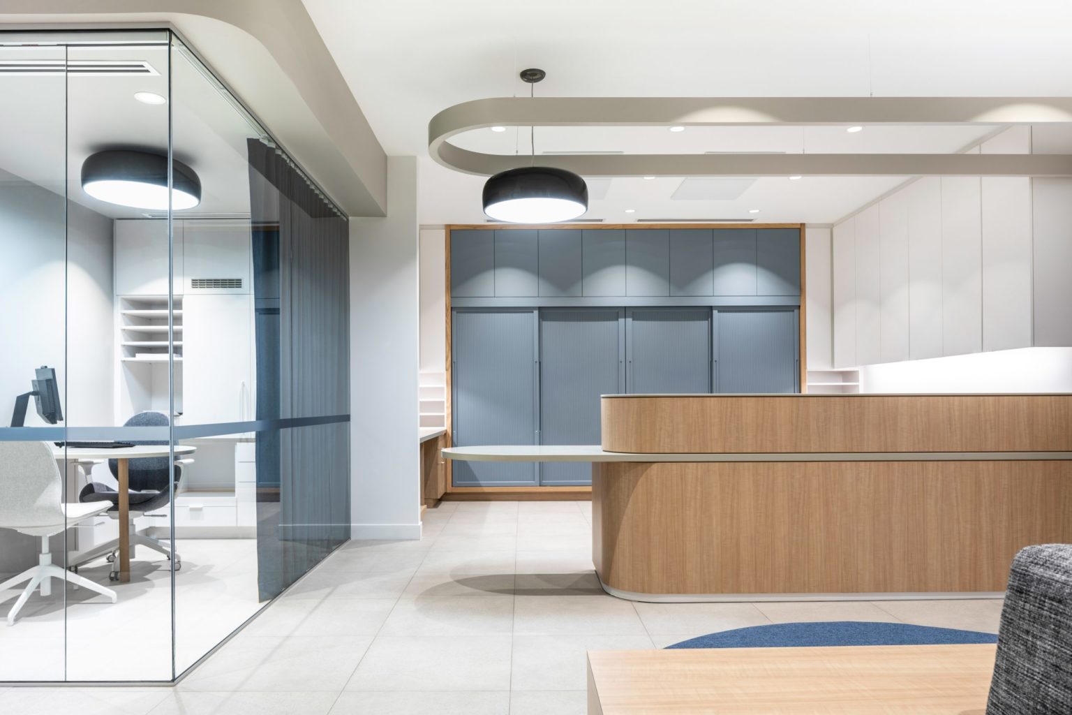
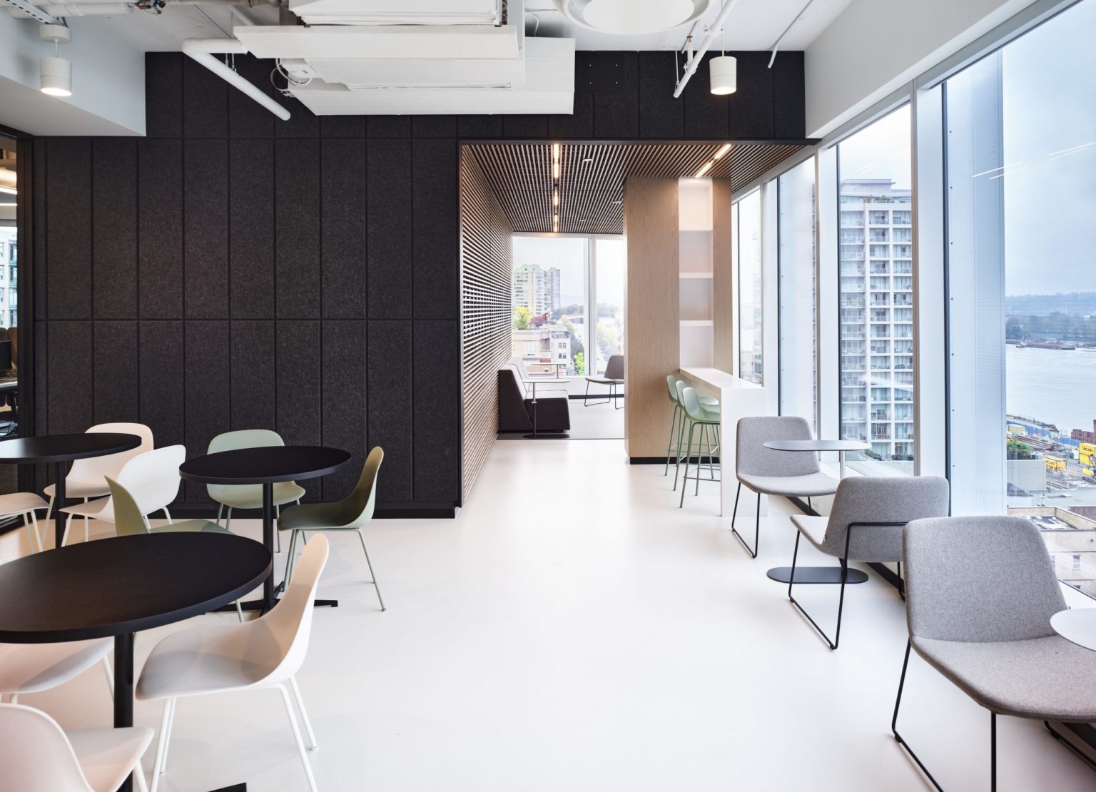
Enclosed meeting spaces are housed on the South end of the office, allowing for quiet retreats from the otherwise open environment. The glazing complements the classic architecture of the existing wood beams and views along a quaint, tree-lined street. The rooms themselves combine lounge seating with traditional meeting tables to facilitate large groups or serve as individual work areas for two or more people. Subtle textures in the carpet and drapery, soft seating, and an array of indoor plants further the serene nature of the minimalist interior.


