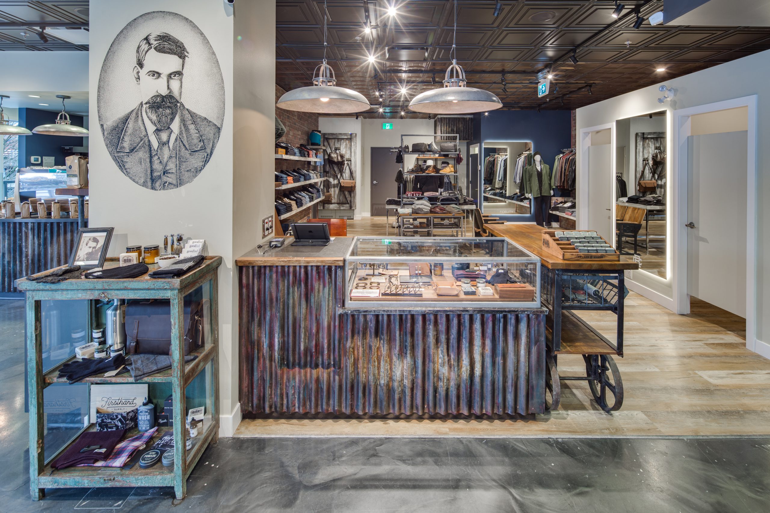
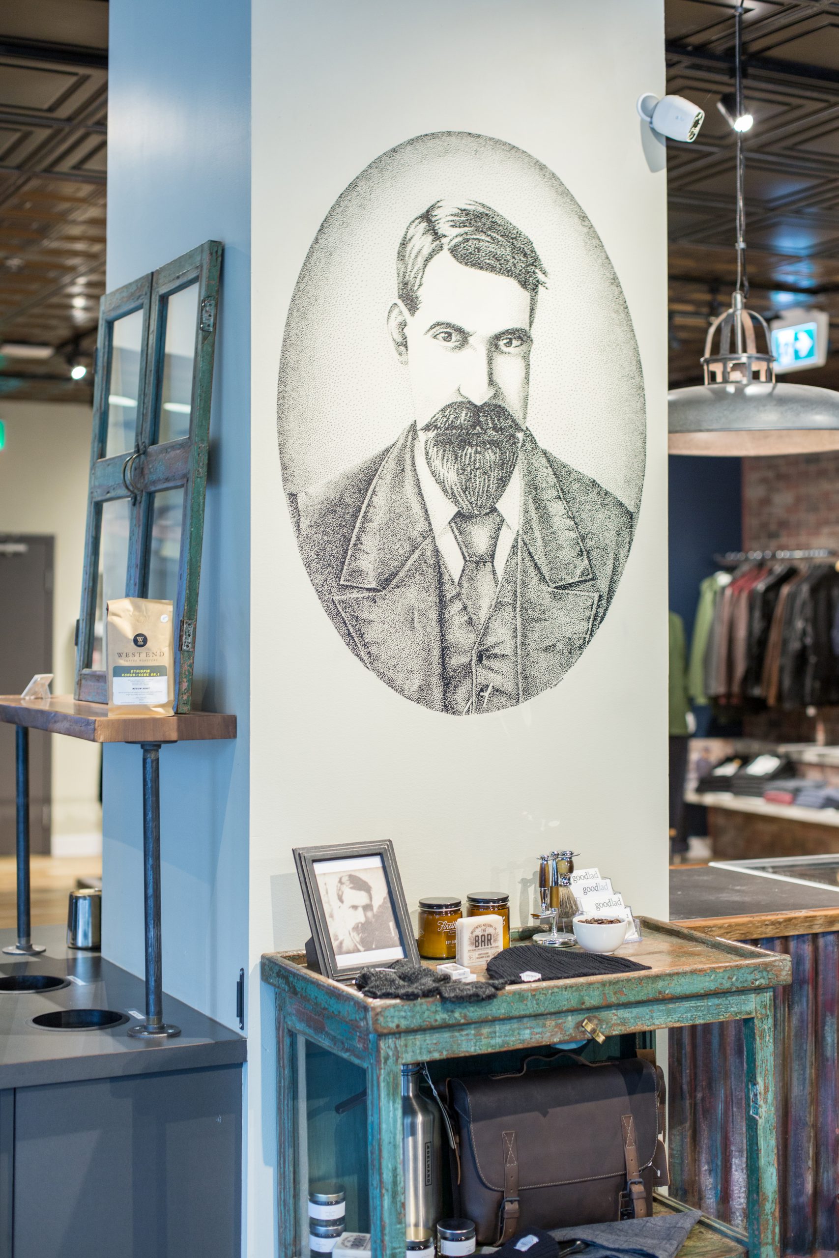
Another primary feature of the space is the mural of store owner Shane Meier’s Great Grandfather, Mr. Goodlad himself, at the front of the store. The artwork adds a touch of family history to the space, while speaking to the vintage aesthetic.
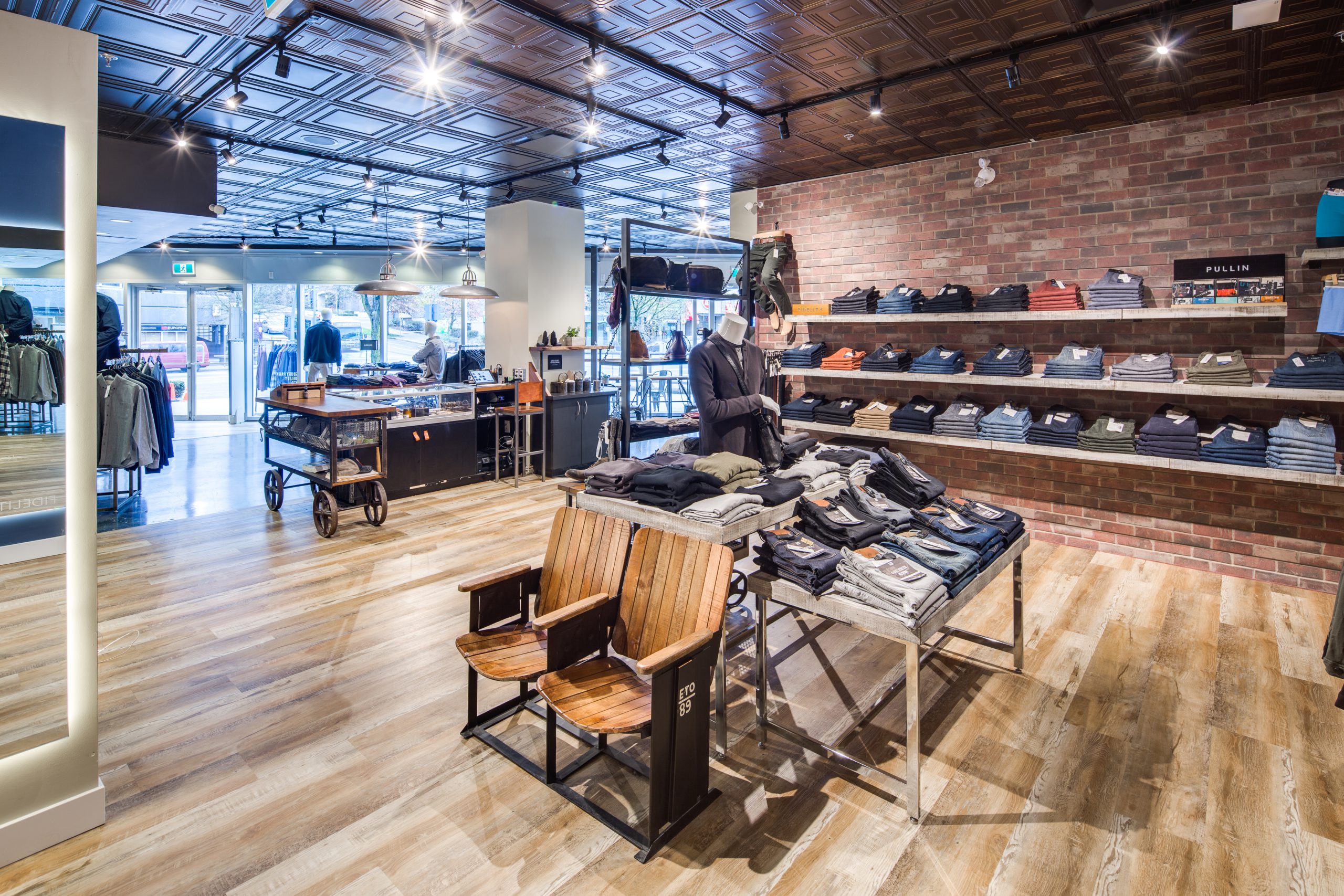
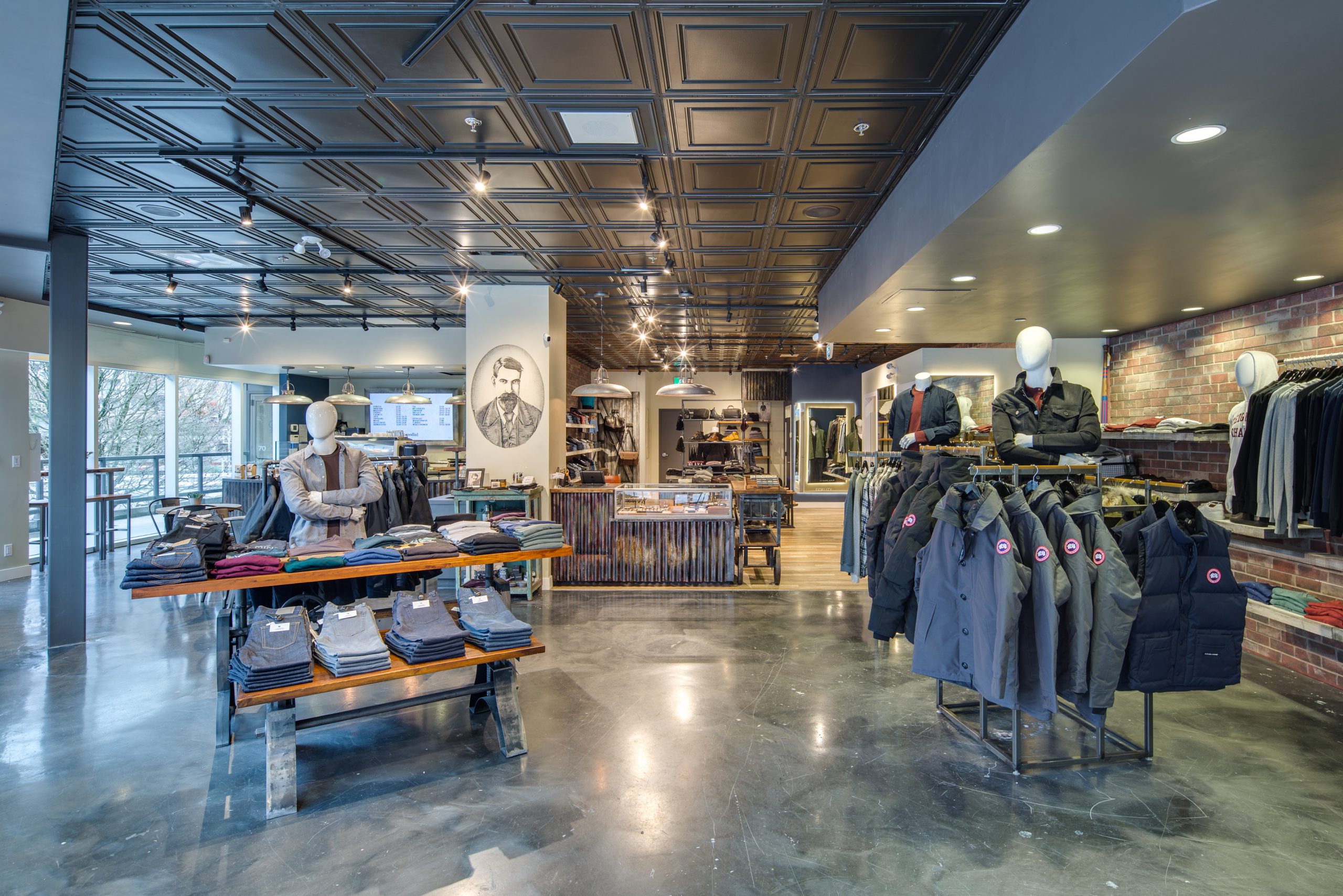
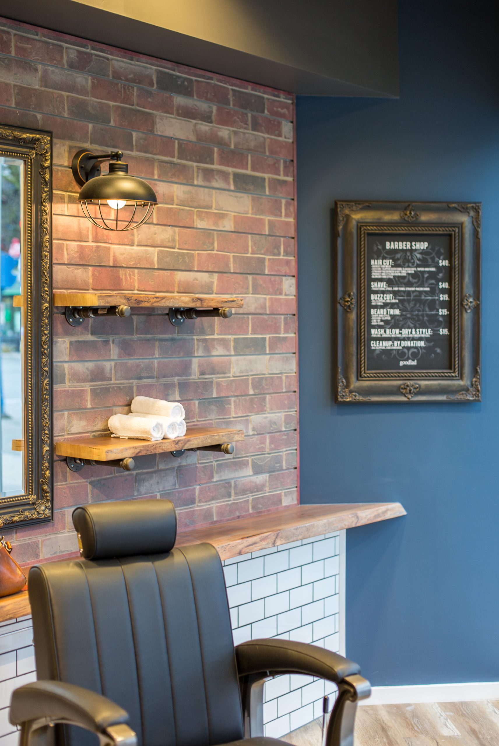
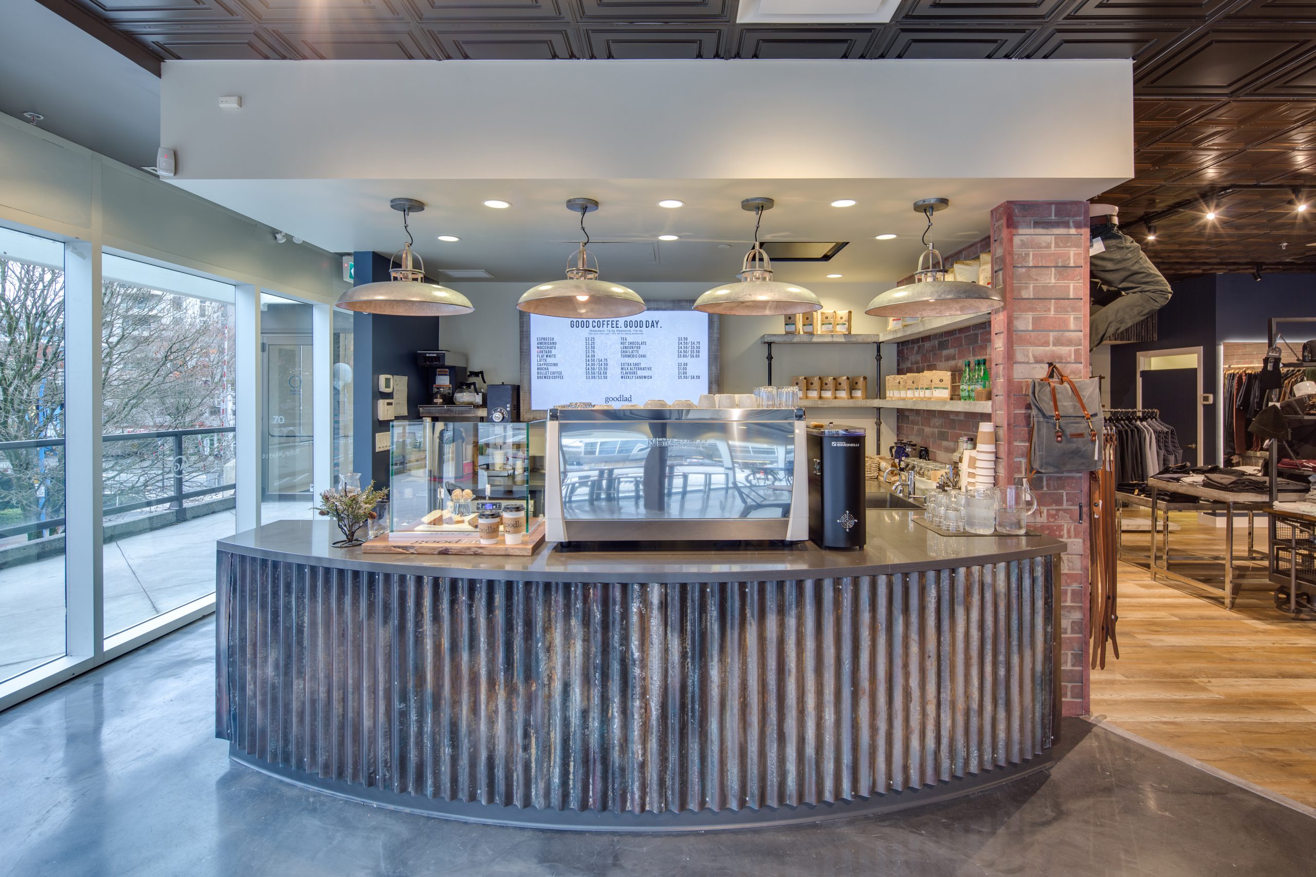
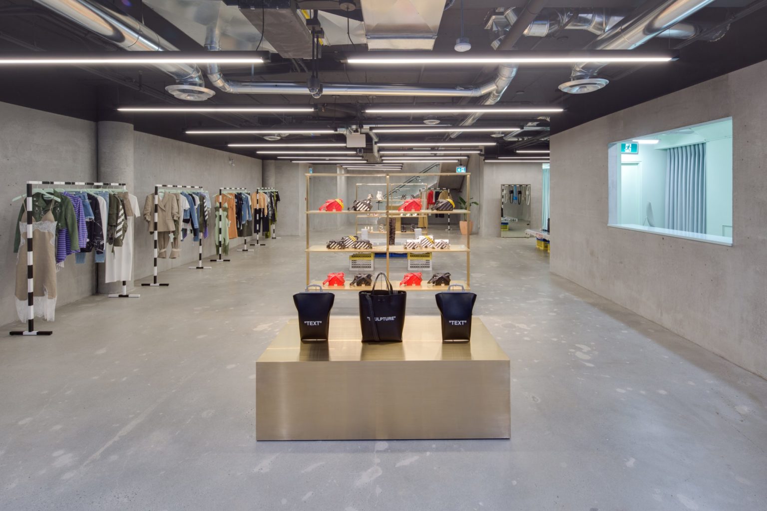
Designing this space was not without its challenges. The shop is essentially three different spaces in one: a clothing store, café and barber shop. All three spaces needed to be incorporated seamlessly into the design. We wanted these different sections to feel cohesive yet distinctive, and add to the overall customer experience without looking out of place. We accomplished this by separating the space with subtle visual cues. The barber shop flooring is wood, while the neighbouring retail and cafe spaces are concrete. The wood flooring repeats in the back of the retail space, tying the two spaces together and adding warmth. We also utilized changes in ceiling height to differentiate the various service areas. A lower ceiling around the cafe makes the ordering counter more approachable.
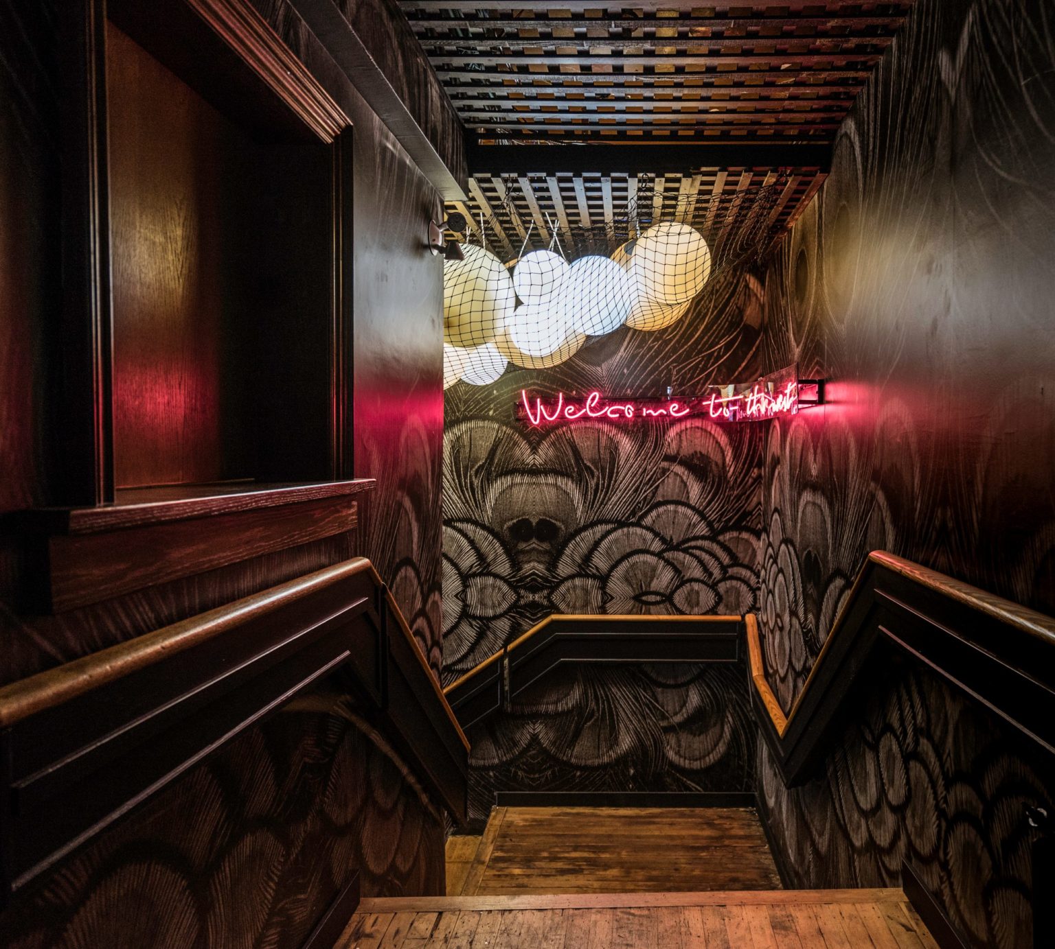
Various industrial elements including antique furniture, exposed wood, rustic corrugated metal and stainless steel light features are used to create a masculine space that’s rooted in the present while giving a nod to days past.
A special thank you to Brad Witt and Double Down Lease Inc. for helping us bring Shane Meier’s vision for this space to life.


